Responsive Web Design.
Responsive Web Design.
Enhancing the scheduling process for a massage parlor.
Project Scope: Imagine a project to iterate upon a responsive flow for Sawadee Thai Spa in Los Angeles, CA in 80 hours. The stakeholders requested a minimum viable product, and the final deliverable will be a high-fidelity prototype to hand off to developers.
My Role: Sole Product Designer- User Research, UI and Testing
Overview
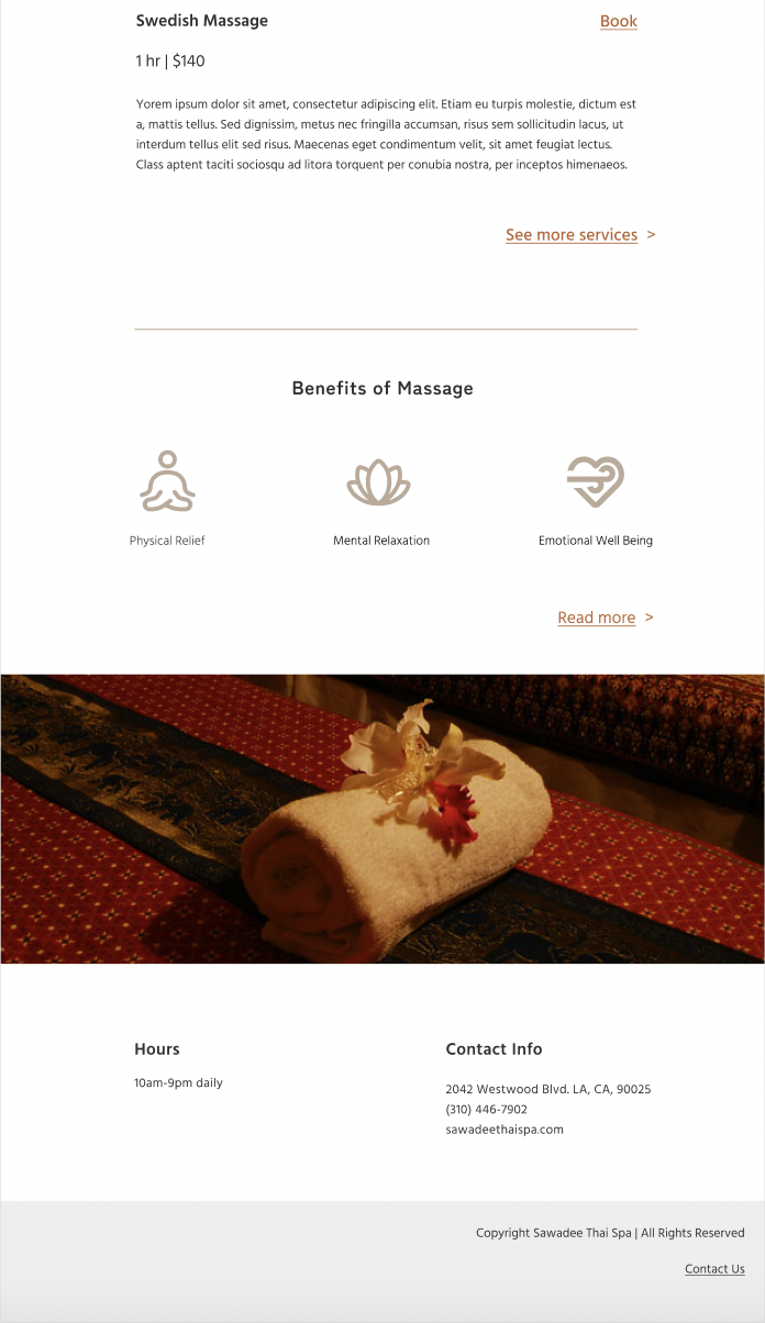
Background: Sawadee Thai Spa is a Spa in Los Angeles, California that offers massage services by licensed massage therapists including massages like Thai, Swedish, Combination, Deep Tissue, Shiatsu, Lomi Lomi, Aroma, Hot Stone, Herbal Massage, and Body Scrub. They hope to provide a calming atmosphere for their customers to relax into the services they offer.
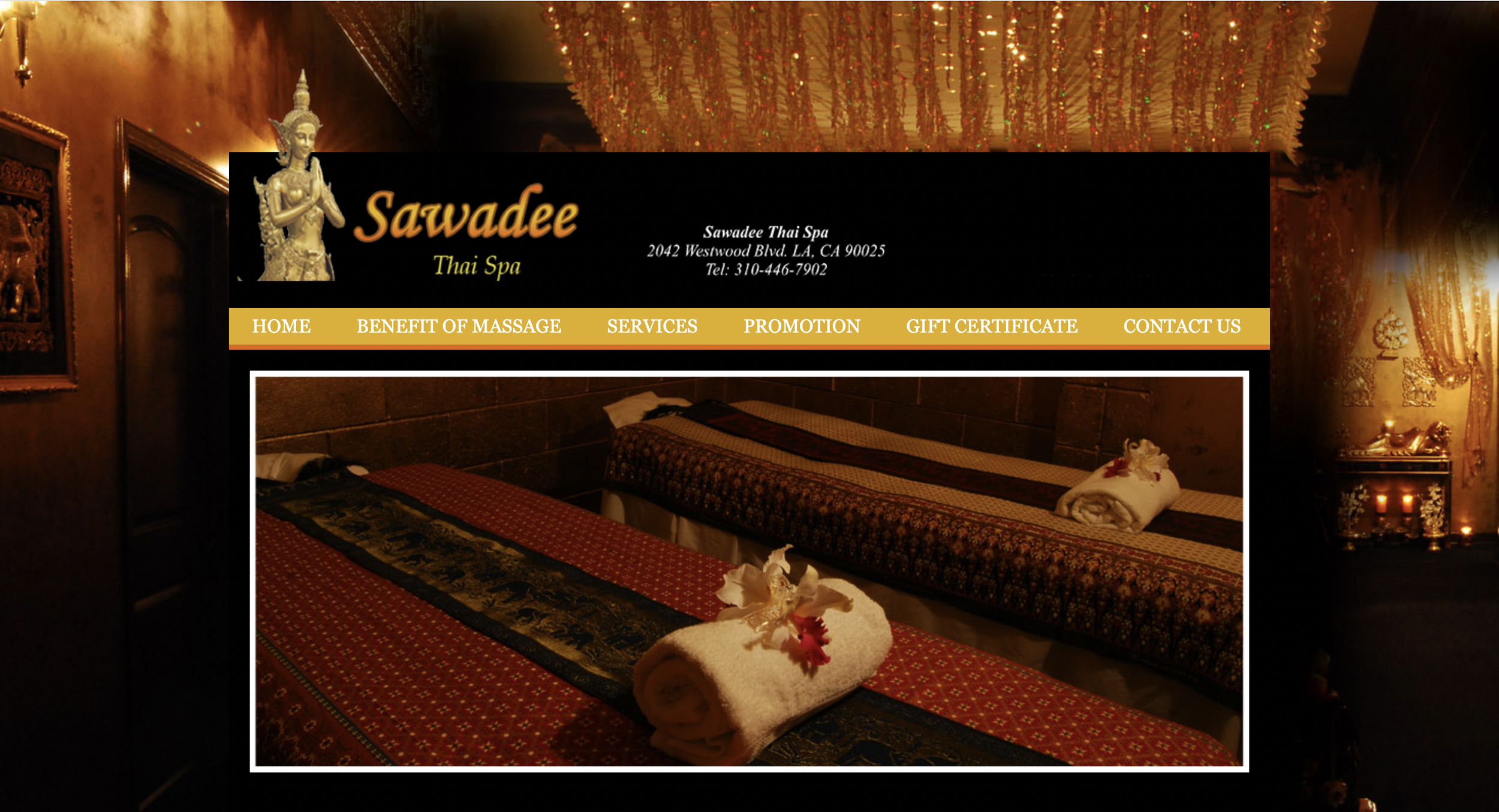
Problem: Sawadee Thai Spa’s website includes no option to book appointments online, which can frustrate users looking to quickly do so. The spa utilizes a phone system with a physical notebook for clients to call to book an appointment. It is also difficult for clients of the spa to see the available options for massage and their prices. The site is outdated and not user friendly. It provides minimal information about the business and what it can do for its customers.
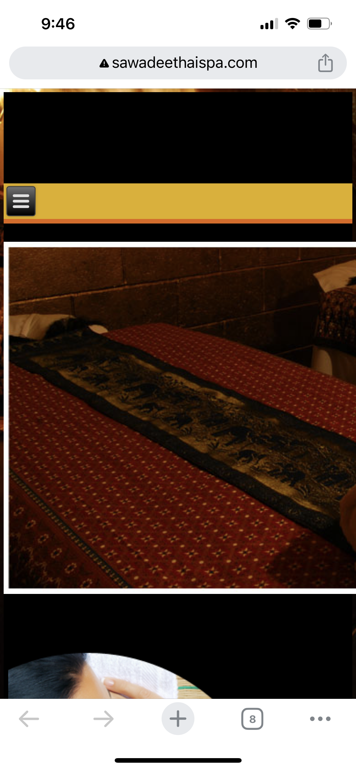
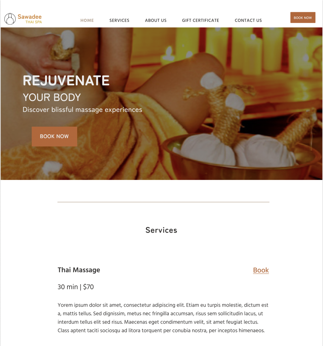
Current website:
Desktop
Mobile
Empathize
The first step in this redesign process for both mobile and desktop is to empathize with potential users. What would make their process easier when looking at Sawadee Thai Spa’s website and attempting to book an appointment for a certain massage?
Target audience: Clients interested in viewing massages offered at Sawadee Thai Spa and arranging a time to come in.
Research Goals
Recognize the challenges and frustrations one faces while attempting to book appointments in general. This way, we can hone in on the features and systems that seem to work and build on them.
Determine what constitutes a business’s professionalism to a client.
Determine what efficiency the customer wants to see from the business when scheduling appointments.
Determine if customers would appreciate scheduling an appointment themselves (i.e. online) or in person.
Understand frustrations people have faced in the past when trying to book appointments.
Determine what features would incentivize one to choose one business over another.
Competitive Analysis
To kick off my research, I started by looking at competing wellness businesses and massage parlors in the area. What do their websites look like? What are their strengths and weaknesses in design?
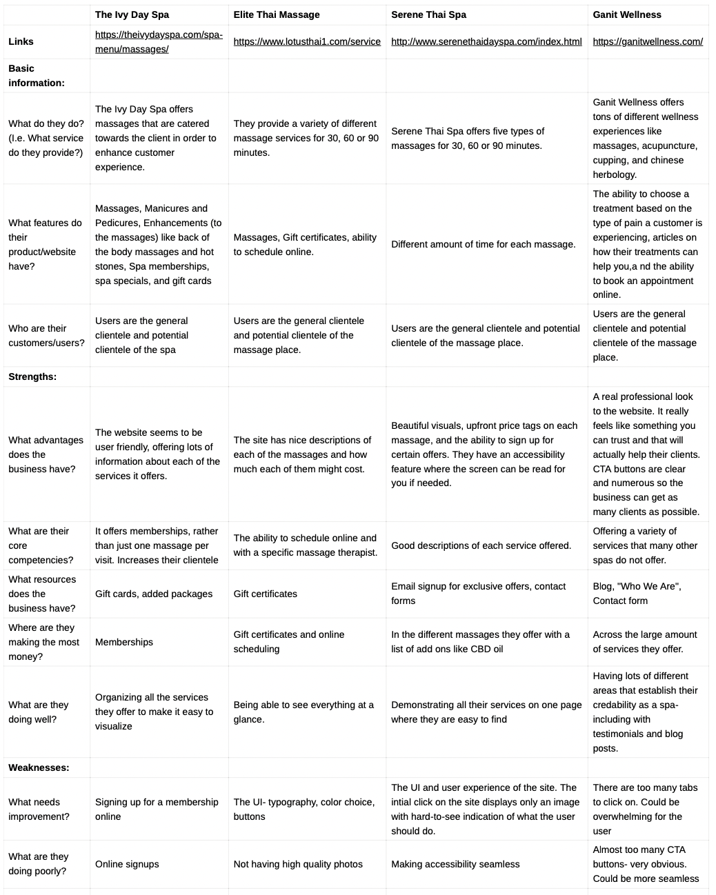

General takeaways:
The more information there is about services offered and how they are beneficial towards the client creates a more credible look for a business.
The way UI is laid out has a huge impact on the professionalism the business exudes.
The ability to book online is important, but even more important is the ability to find how to book an appointment online as quickly as possible.
Accessibility can be critical for sites like these as the goal of each of these business is to make their clients feel better through wellness services.
User Interviews
Participants for the interviews will be people who regularly schedule appointments. Some of them may have an interest in wellness spas.
Some interview questions:
What is your favorite store or business to go to?
How do you think a business establishes credibility and professionalism?
Do you tend to check a business’s website before establishing an opinion on it?
How do you like to make reservations for a certain business- over the phone, in person, etc? What is easiest for you?
If booking online, would you like to see as much information as possible regarding exactly what you will be booking?
Would you rather have appointment times offered to you or search if those times are available?
Tell me about frustrations you’ve experienced in the past when booking appointments.
Do you like to treat yourself to self-care such as going to wellness spas?
What would incentivize you to go to one wellness spa over another?
Affinity Map
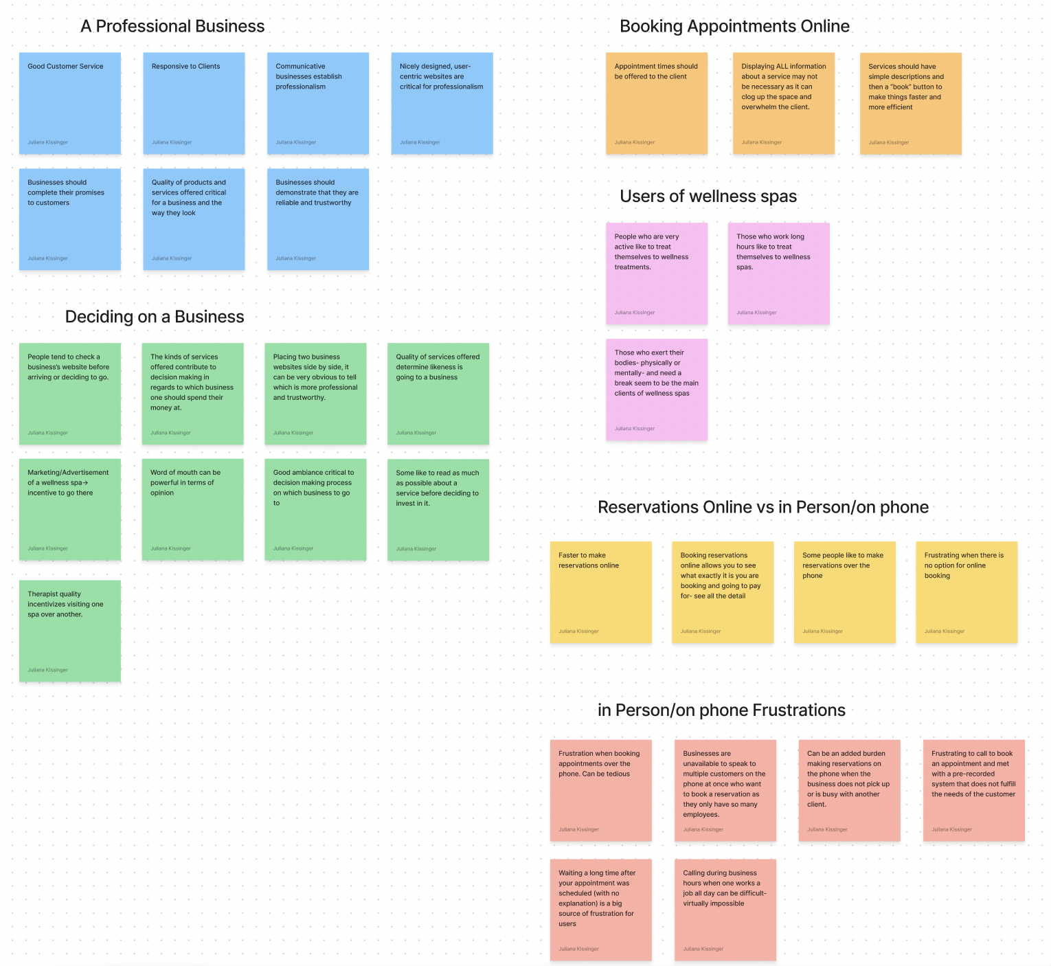
Research Insights
Insight #1: Frustrations arise for users when they cannot find the information they need before making an appointment. There should be information about each service offered on a website.
Insight #2: Users are more likely to enjoy the option to book appointments online rather than taking the time to call the place.
Insight #3: Users would like the booking process to be intuitive and easy to go through. They should leave the page with an understanding of every detail of their booking experience.
Insight #4: Businesses like spas and massage parlors cater towards those who need to relax, like users who exercise a lot or who have a stressful work-life balances.
Insight #5: Users prefer to pay more attention to businesses that exude professionalism and are clear about what their services will do to benefit them as consumers.
Define
POV and HMW Questions
POVs
What is the right problem to solve?
I’d like to explore ways to limit frustrations with the process of booking an appointment.
I’d like to explore how a business can establish professionalism through their website.
I’d like to explore why people tend to choose one business over another similar one.
I’d like to explore the ways booking reservations online can be better than booking in person or over the phone.
I’d like to explore the types of people that tend to go to wellness spas and what exactly they are looking for in the business.
HMWs
How might we create a user interface that does not frustrate clients trying to book an appointment?
How might we make the “book appointments” button easy to find?
How might we give the user as much information as they need before they decide to book an appointment?
How might we demonstrate the quality of services offered?
How might we offer adequate appointment times within a given time frame?
How might we widen the scope of clients who come to wellness spas?
How might we make the booking process efficient and not tedious?
How might we create a calming ambiance virtually that reflects the business’s ambiance in person?
Chosen POV and Chosen HMW:
The main POV: I’d like to explore ways to limit frustrations with the process of booking an appointment.
Main HMW:
How might we make the booking process efficient and not tedious?
How might we create a user interface that does not frustrate clients trying to book an appointment?
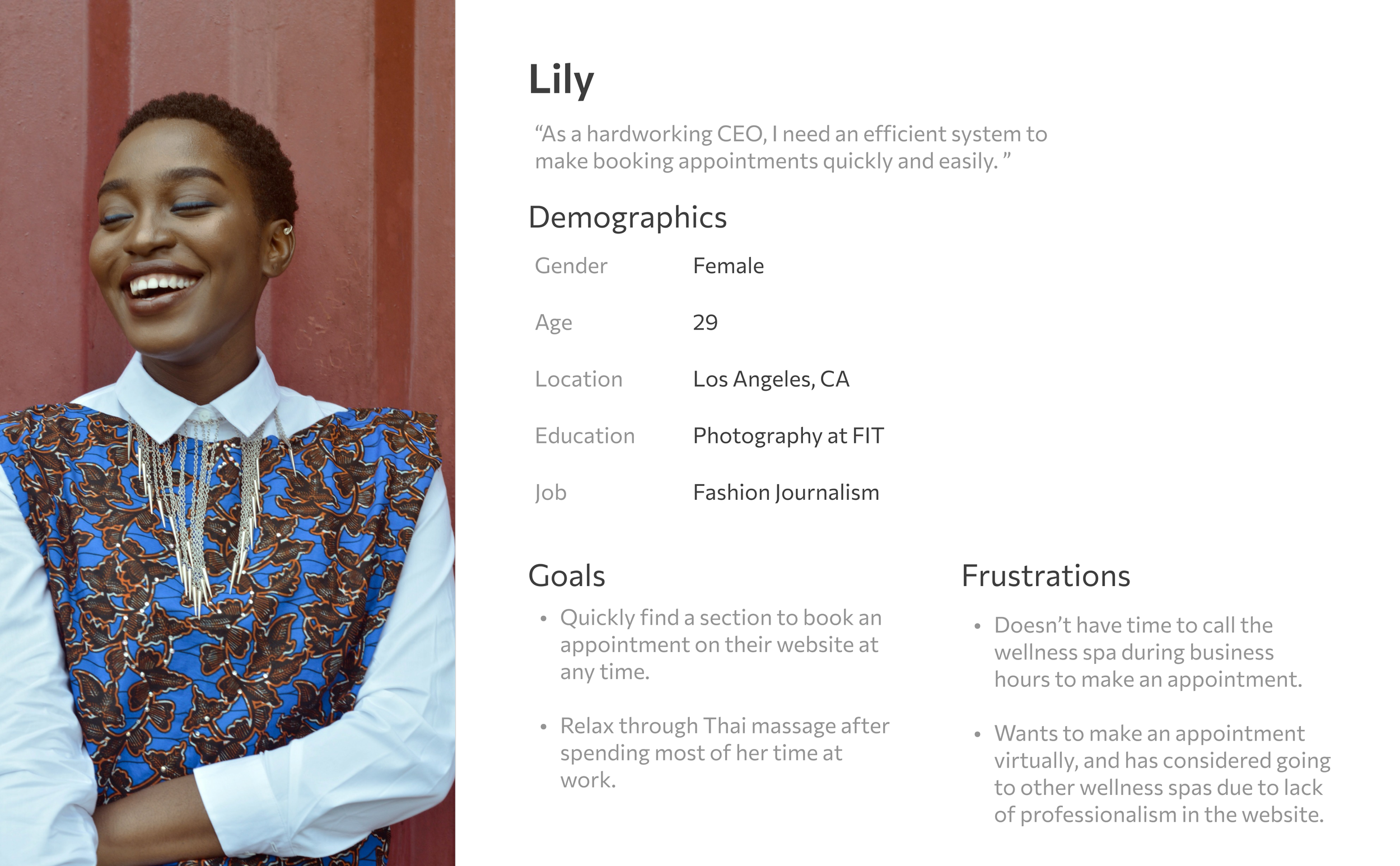
User Personas
With an idea of what I wanted to focus on regarding possible solutions to the problem, I developed two user personas who were facing frustrations with the booking process on Sawadee Thai Spa’s website.

Project Goals
Business Goals:
Driving more revenue by making the booking process intuitive and efficient on the client’s end. The ease could surprise clients and allow them to book an appointment at a faster rate compared to booking over the phone. This process could also increase the number of customers the business generates and therefore more revenue from a greater number of people.
User Goals:
The goal of the user is to not be confused or frustrated when figuring out how to book an appointment on the business’s website. It should be easy to follow and complete, with confirmations sent regarding the appointments. The user wants to book the appointment, knowing exactly what the appointment entails, as efficiently as possible and know that they are locked in for that time.
Common Goals:
Simplifying the booking process so that it can be understood on both the client’s and the business’s end.
Ideate
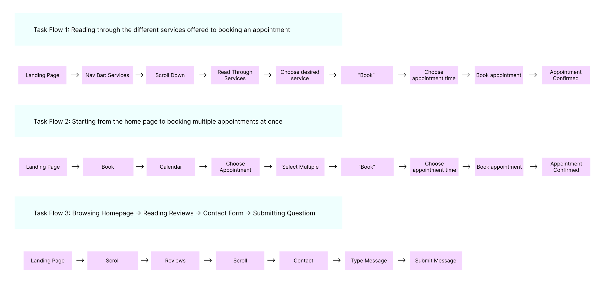
Task Flows
With a deeper understanding of what goals and decisions a user might need to make in the booking process, I created two potential task flows that might help me design my wireframes.
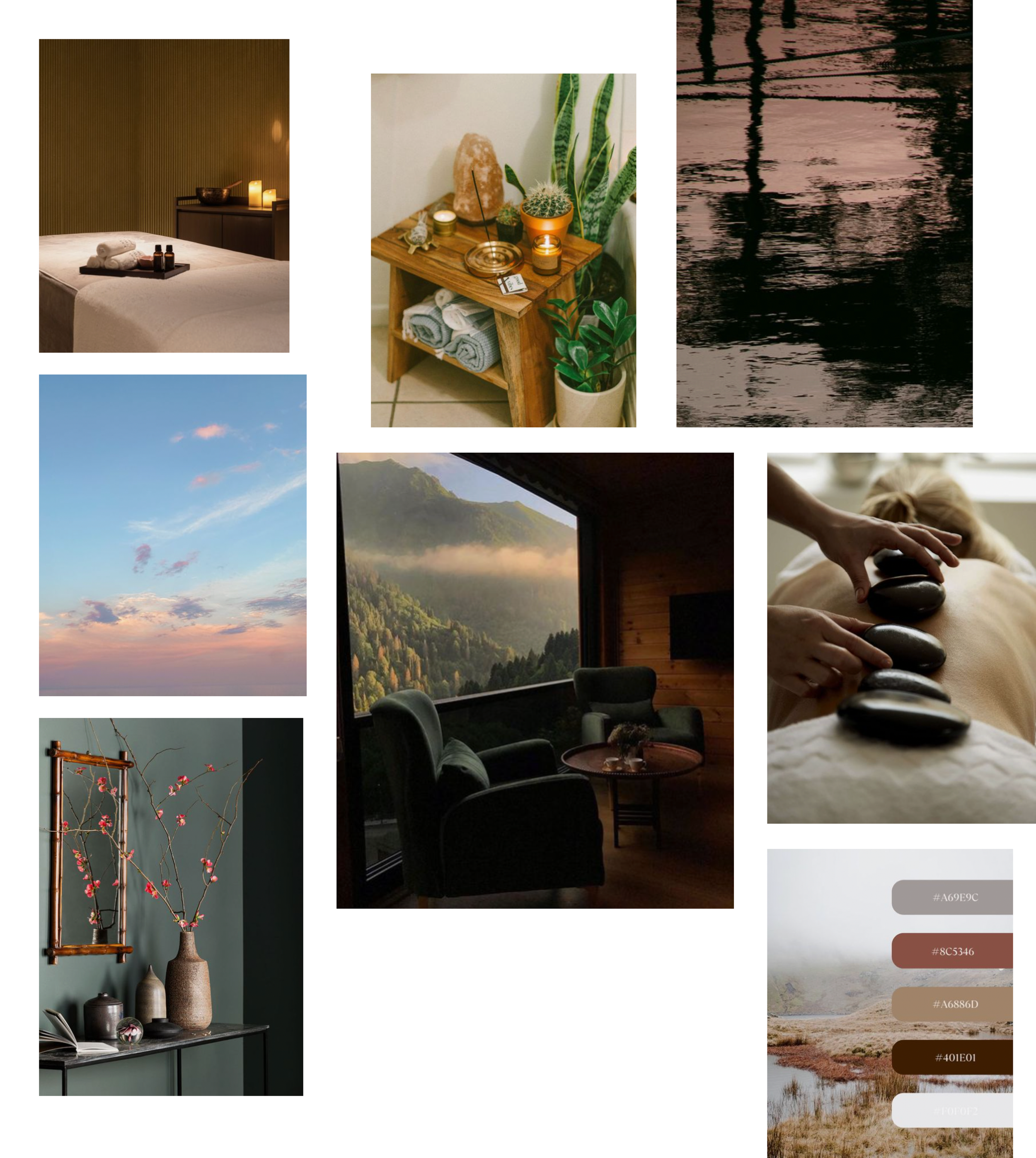
Mood Board
I wanted to create a serene environment yet maintain the same energy that the spa already has, especially as it is a Thai Spa. Keeping the Thai aspect present while simultaneously improving the site and creating a calming atmosphere as shown in the mood board below was critical in my design choices.
Design
Low-Fidelity Wireframes
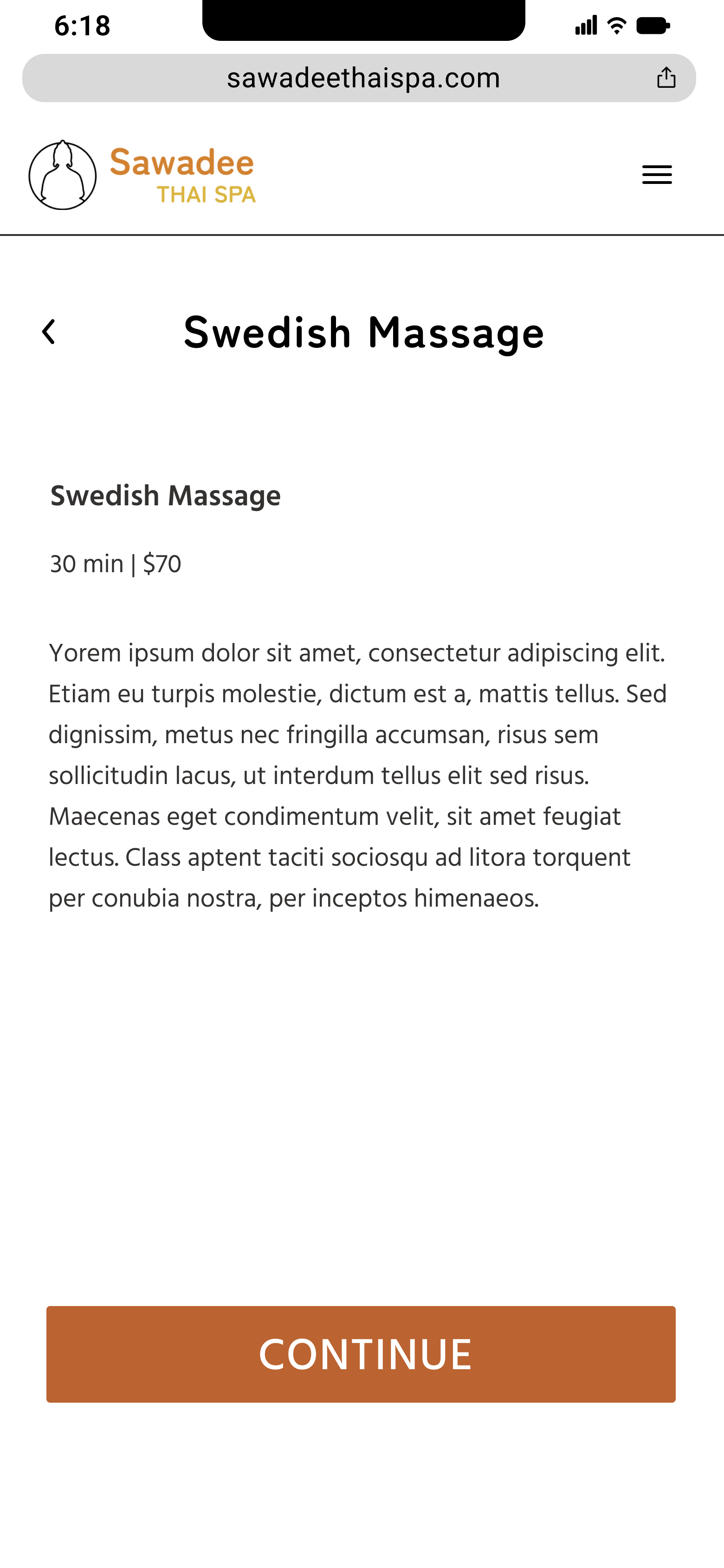
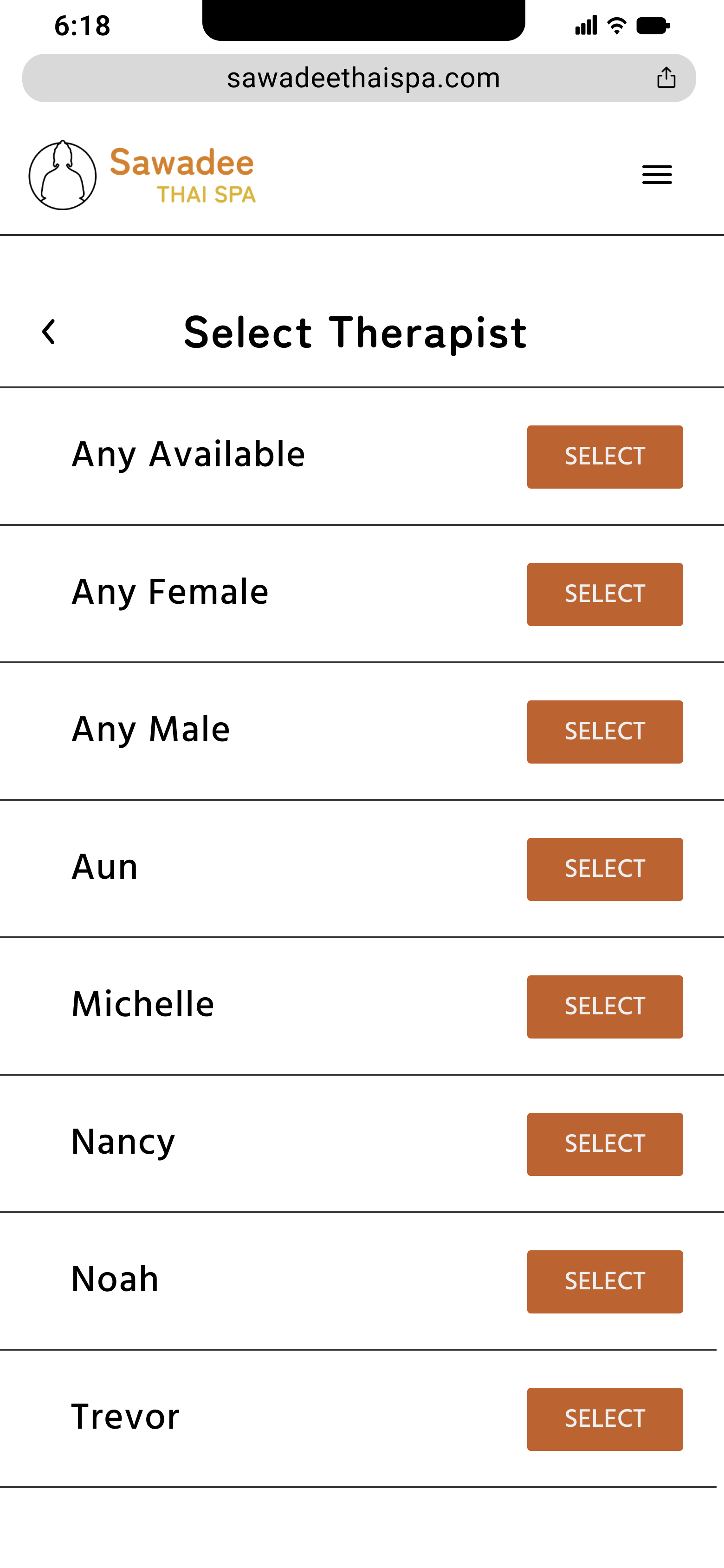
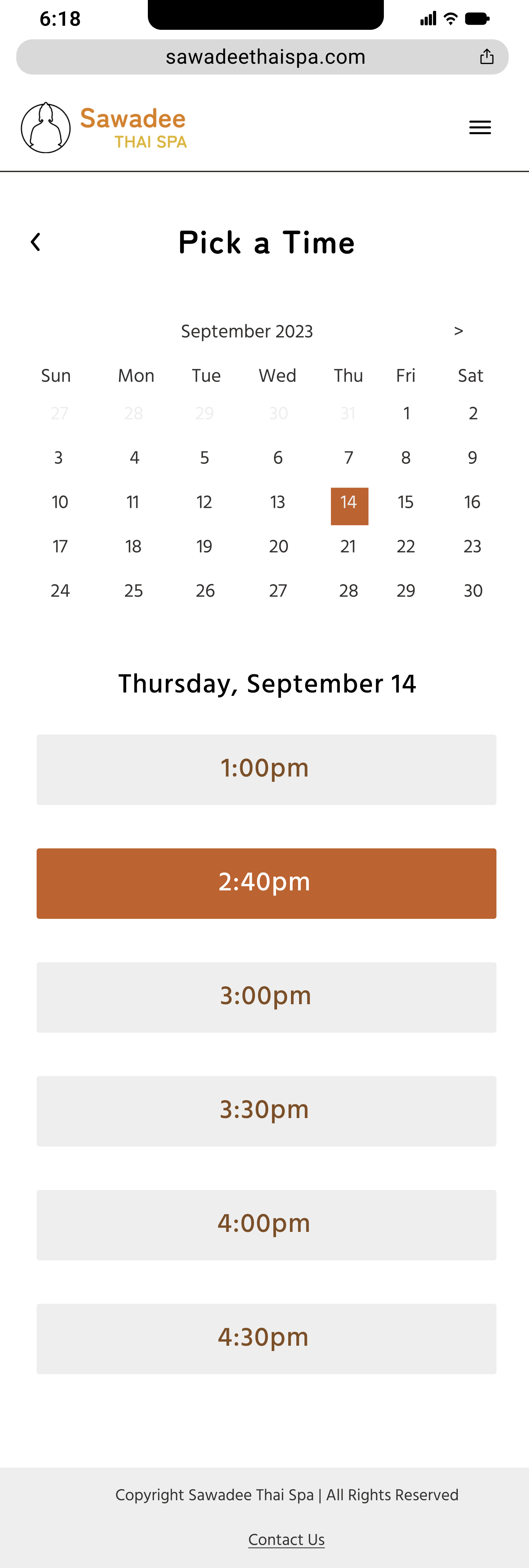
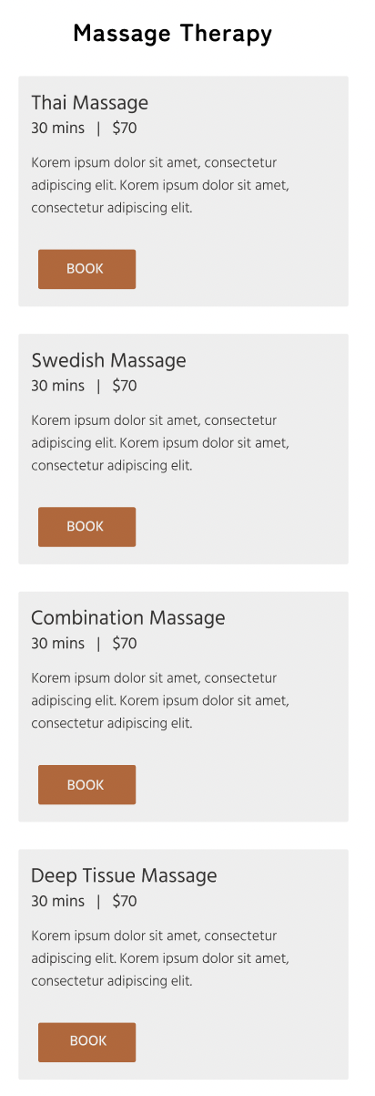
I created wireframes for the home page, hamburger menu, services menu, and multiple screens for the steps in the booking process. Some of those steps entail choosing a massage type, selecting a therapist, picking a time, a confirmation screen with all the details, and a final confirmation notification. In my wireframes I looked at multiple options, notably for the hamburger menu and the method of displaying each of the different massage types.
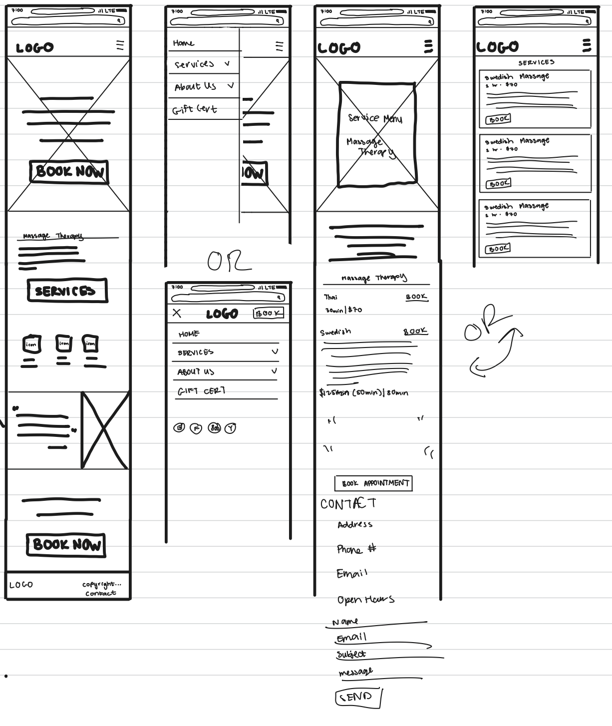
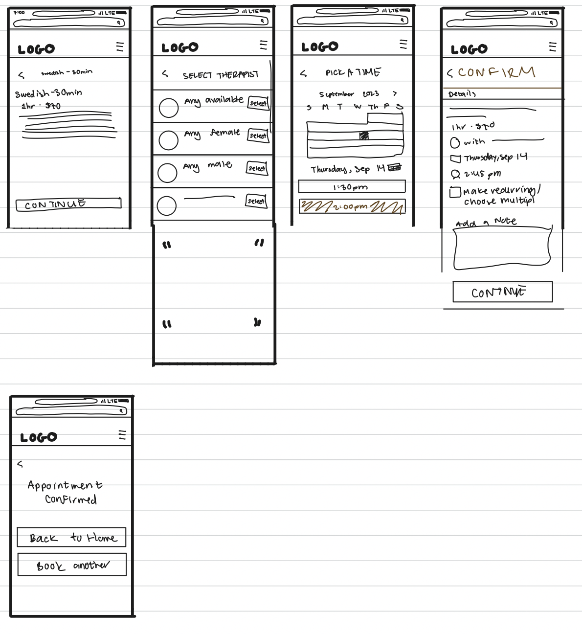
In order to understand how effective my screens may be in solving my problem, I asked other designers for their thoughts on my designs. I especially wanted help with choosing between my two options for the hamburger menu and the two options for how to display the massage types. After receiving feedback from peers, I decided on including the full-screen hamburger menu as well as utilizing cards to display the massage types.
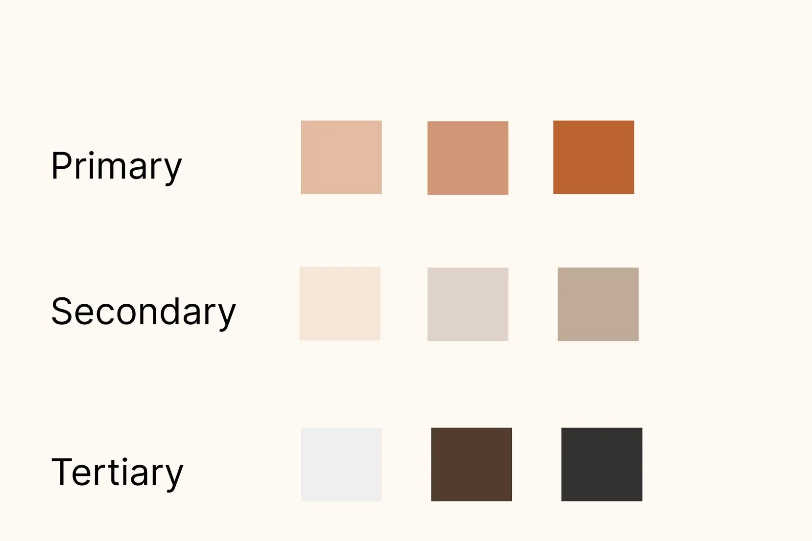
Color Palette
In an effort to maintain the cultural aspect of the massage parlor, I used orange as the primary color and went with more neutral beige tones for the secondary color.
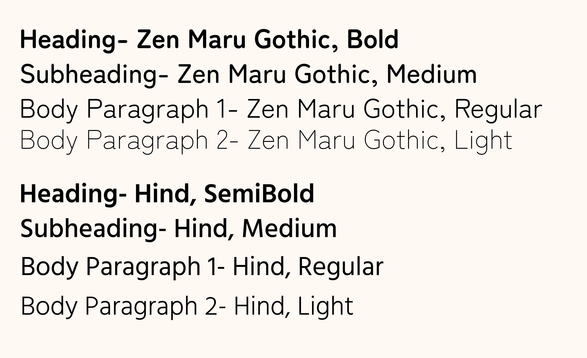
Typography
I primarily utilized Zen Maru Gothic as my typeface due to its rounder features that provided a sense of tranquility.
Brand Logo
Along with creating a better booking system, I thought it pertinent to additionally work on creating a new logo for the spa, as the other was last updated in 2014 and a new one was necessary to match the new look of the site.
After some thought, I finally landed on the logo idea below, utilizing the same orange and yellow colors from the original logo.
Original Logo
UI Components
New Logo
Icon Set
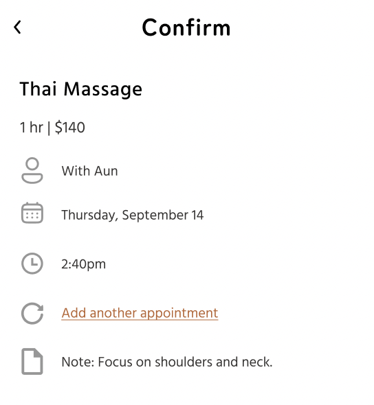
My intention with these icons was specifically for the confirmation page when booking an appointment with the spa. After creating a number of icons for the confirmation page, I additionally added a couple more on the home page, which creates a sense of cohesion in the design.
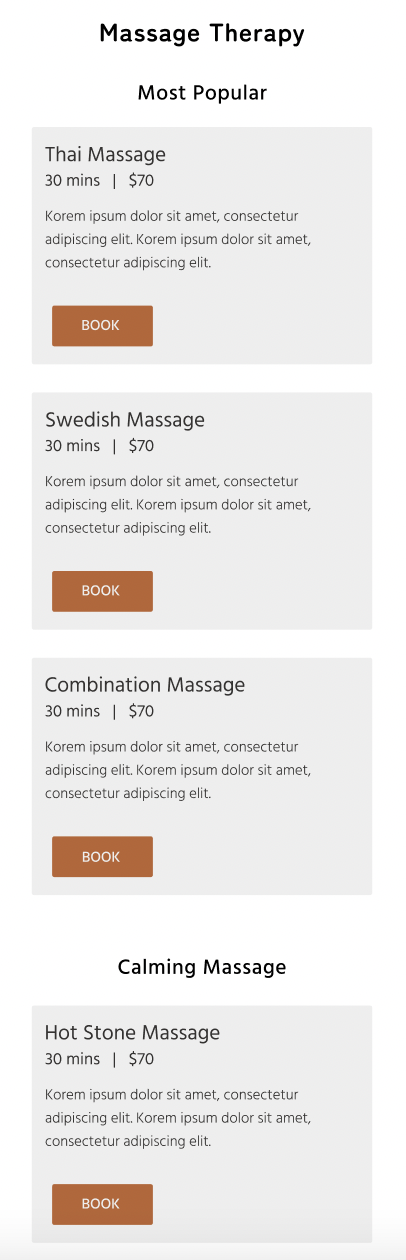
I created the UI components below notably because I knew that I would utilize them multiple times throughout my design. The cards especially became very useful for the services menu in my final design.
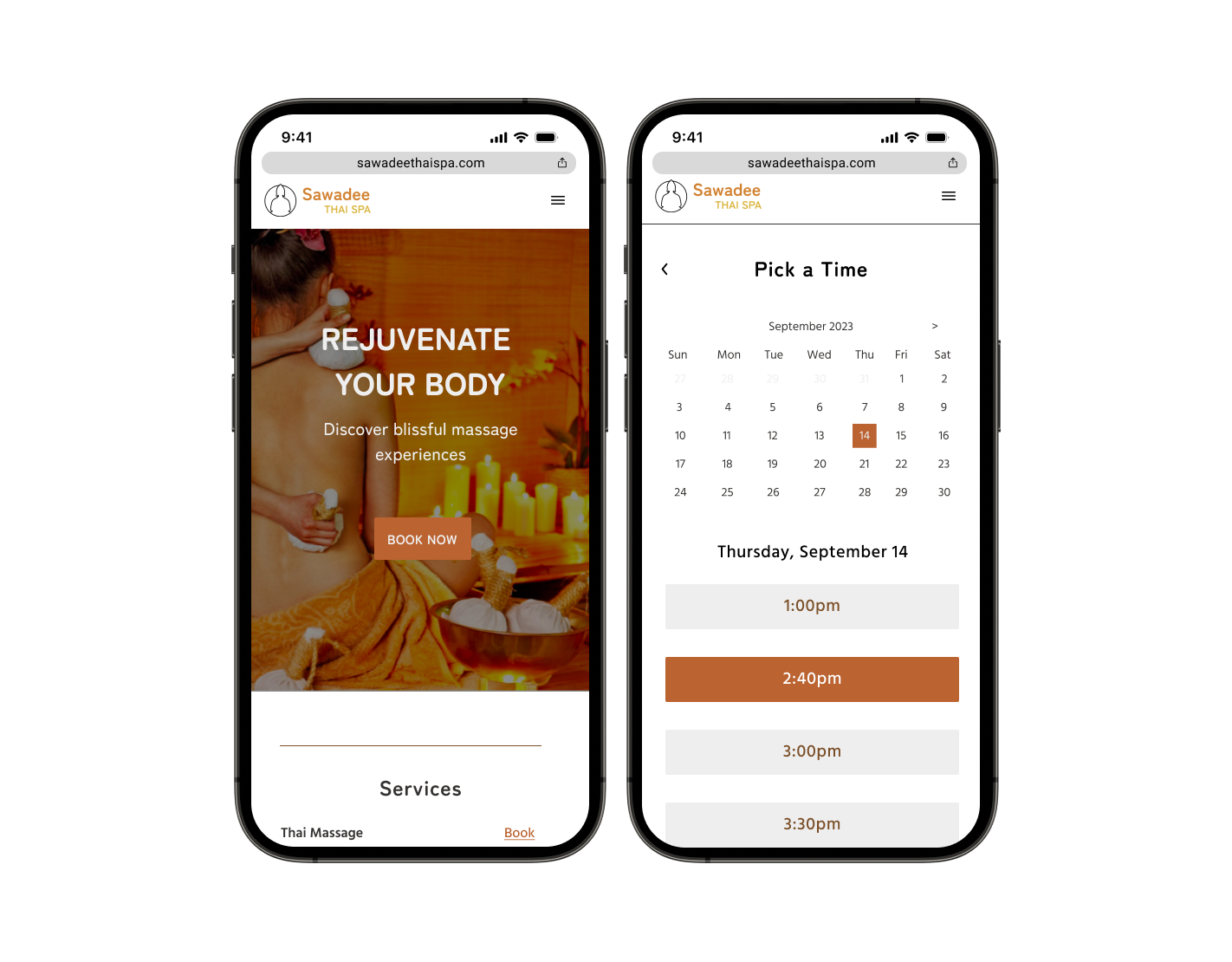
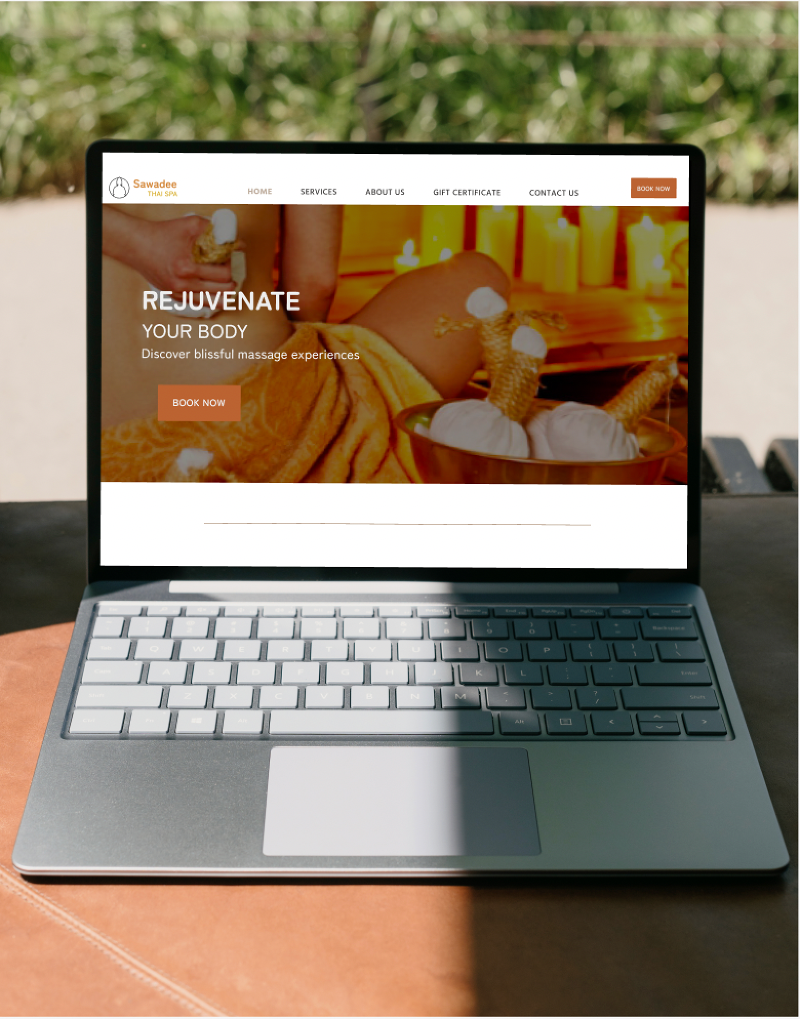
High-Fidelity Wireframes
Mobile Frames
Desktop Frame

Testing
User Testing
Goal of the research: Make sure that it is simple and intuitive to book an appointment at Sawadee Thai Spa. See if all your findings from research are met.
Task 1: Read through different services offered and book a 1 hour Thai massage with Aun.
Task 2: Start from the homepage and book two 1 hour Swedish massage appointments with Aun, one at 2:40 September 14th and one at 3:00 September 21st.
User 1-
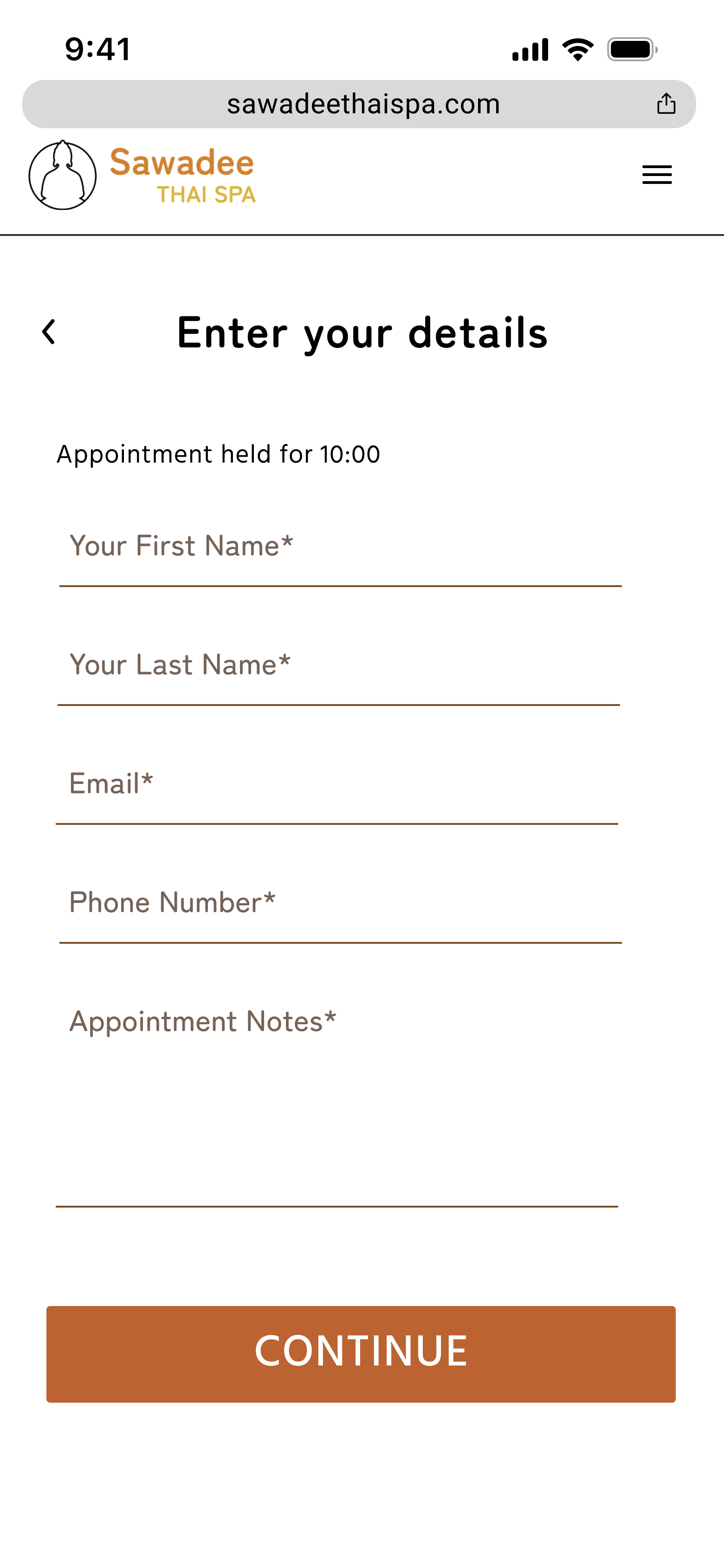
Task 1: Went through first task with ease. Started at the home page and scrolled down to services where she found the “book” button for Swedish Massage. Went through each page quickly. Noted it might be better to add a screen where one inserts their name and email, as there is nowhere to keep track of who is making the appointment.
Task 2: The second time, the user clicked the “book now” button immediately on the landing page and went through the whole task pretty similarly to the first task, they just had to click Swedish Massage from the services page. The user noted that it was tricky trying to figure out how to make another appointment as you had to wait until you get to the confirmation screen to see it. They noted the CTA button on the confirm screen should probably say “confirm” instead of “continue.”
User 2-
Task 1:
Pressed the “book now” button on the home page and found Swedish Massage easily through that. Before he pressed on it he scrolled through all the massages and mentioned that there could be some categorization to it as there were so many massages offered. Pressed continue. Selected therapist “Aun”. Chose 2:40 but was confused why you could not press other buttons. This is not a design issue- it’s just not a live website. He said that it might be better to pick a day and time before choosing a therapist. This makes sense from a UX standpoint.
Mentioned that the continue buttons are in different places on different pages. Need to place all CTA buttons at same position
Task 2:
Going through the second task, the user was able to complete everything without noting anything to me. At the end, I asked him if he had any questions or comments as he was scrolling through the website. He mentioned several things:
There should be somewhere where the user can choose between a 30 minute or 1 hour massage, as both options are shown to be available.
The top of each screen doesn’t necessarily look like an apple iphone.
There could be an icon for the notes section on the confirmation page
There could be time conflicts if someone presses on “choose recurring”- how am I going to demonstrate that it cant be recurring? Maybe could change to “choose another appointment”
Some Revisions
Removed the carrot on the hamburger menu. Unnecessary
Placed all the CTA buttons in the same relative position- mostly “Book Now” buttons.
Changed “continue” on the confirmation screen to “confirm.” This makes more sense.
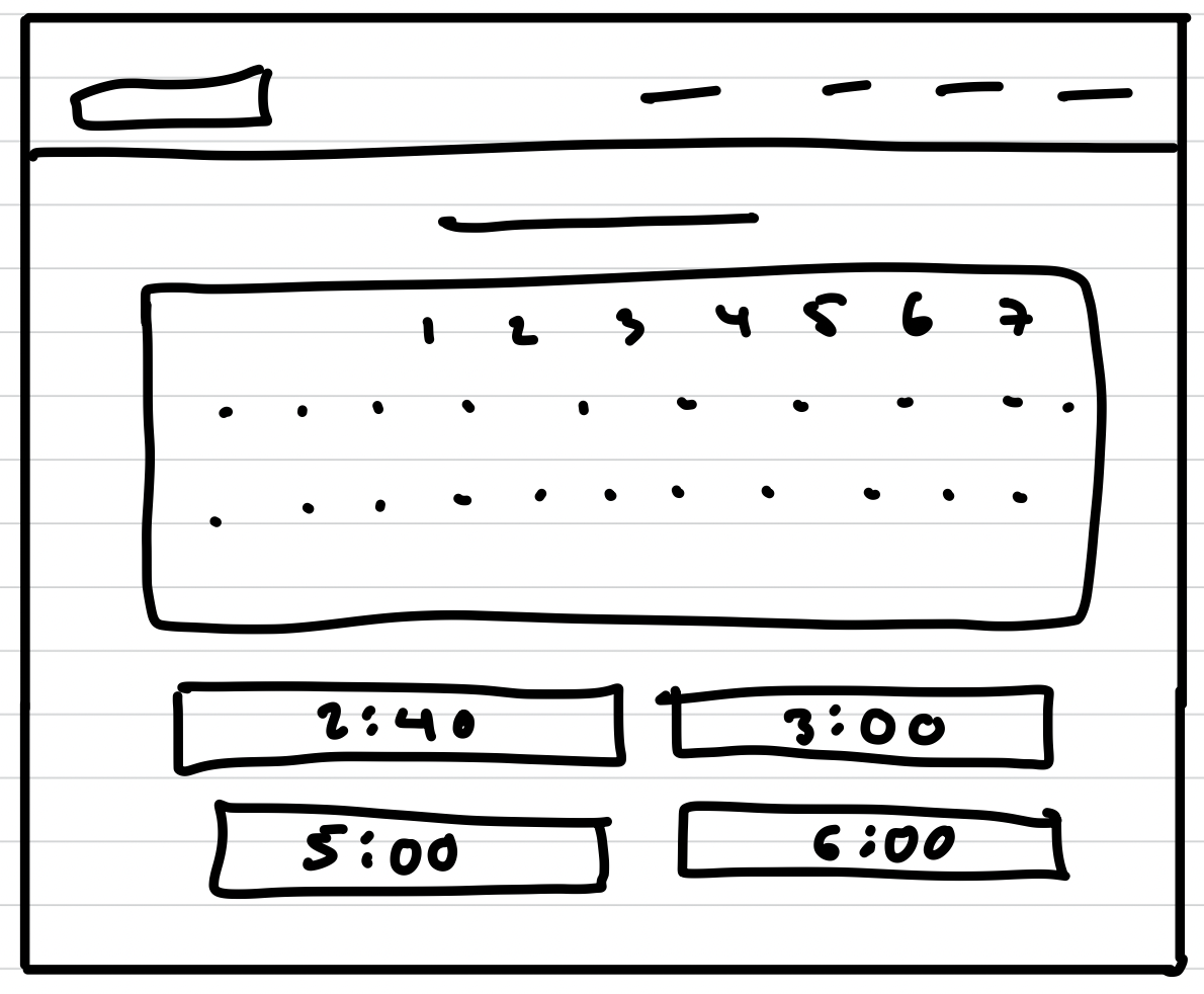
From a UX standpoint, you would want to choose a date and time before choosing a therapist. So, I switched the screens to follow that order,
Added option to choose between 30 minutes or one hour.
Added a screen to create an account- this will allow for the user and the business to get confirmation of the appointment.
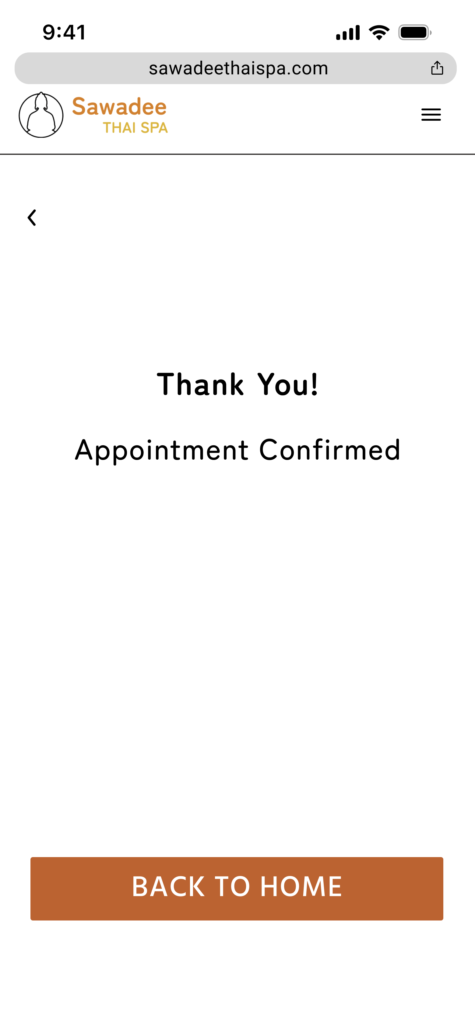
Added a final confirmation appointment so that the user can see that the appointment is fully confirmed.
Switched out the top section of the screens, including time and wifi, for real apple designs.
—>
—>
For consistency, I added an icon for the notes section of the confirmation screen as well as changed the phrase “Create recurring” to “Add another appointment.” Recurring appointment options can be talked about in person as the same massage therapist may not be available for recurring times.

—>
The services menu would take lots of time to scroll through. I added sections to divide the different massage types and create breaks in the length of scrolling.
Prototype
Final Thoughts
In this project I not only revamped the look and design of Sawadee Thai Spa’s website, but in the process created a comprehensive booking process for appointments that includes details of services offered along with a step-by-step procedure of ensuring that clients get the exact appointment they want. This new method of booking would limit users’ frustrations with not knowing the kinds of massages offered and having to call the spa itself to book an appointment. In turn, the new look and booking process could attract new customers and/or incentivize returning customers to book again, perhaps to try out a different service or massage therapist.
This design thinking was challenging for me as it was the first time I ever led a project. However, it taught me perseverance as well as the importance of receiving feedback, from both peers and potential users of the product. I am satisfied with my iterations and have grown my design thinking skills exponentially since my first look at the problem.