
Designing a recommendation-prioritization app for entertainment options you love.
Project Scope: Imagine you create an end-to-end design of an app with an MVP, a minimum viable product, that solves a clearly defined problem in 80 hours. The final product will be a high-fidelity prototype to hand off to developers.
My Role: Product Designer- User Research, UI, and Testing
Overview
Project Background: In day-to-day life, people tend to get many recommendations on new things they can enjoy in their downtime: new music to listen to; a relatable podcast to follow; a new tv series or movie trilogy to watch; or even a book series to pour over. Each time, one may add a new note to their notes app or write the recommendation down on a piece of paper. With all these recommendations piling up over time, it can be difficult to keep track of those that you want to actually entertain in your down time.
The Problem: With all the downtime recommendations one receives from others regarding music, podcasts, movies/tv and books, how would you prioritize what you want to listen to, watch or read in your spare time?
Potential Solution: As someone who encounters this problem myself, I thought there should be some sort of tool where a user can prioritize every piece of entertainment they have been recommended into one place. This way, the user can quickly choose a pastime activity that they might have wanted to enjoy for a long time, per recommendations from others. There can additionally be a chat function or home page where people post their recommendations so that the user can add them to their list of music, podcasts, movies/shows or books to enjoy.
In order to understand others’ frustrations with this problem and brainstorm what the possible solution might look like, I needed to conduct research and empathize with potential users.
Empathize
Research Goals:
Identify if this hypothetical problem is an actual issue that people experience amongst their everyday lives.
Learn which group of people this app would pertain and who would benefit from such a tool.
Understand what people do- the first thing they do- when they get a recommendation from someone. Do they follow up with that recommendation and actually carry it out?
Identify what kinds of recommendations people get the most.
Determine if users have used other apps for recommendations, for anything. What did they like about it?
I found that the best research approaches in this instance were competitive analysis, in order to directly compare how competing or similar apps have accomplished what I wanted to accomplish, and interviews, due to the direct and face-to-face nature of learning about others’ way of thinking and design favorites.

Competitive Analysis
There are a couple apps already out there that have a similar idea. However, none of them are based on entertainment-only pastimes. My product would feature prioritizing and organizing a list of music, podcast, book, and movie/tv recommendations, where one can browse through community recommendations and add them to their list if desired. The MAIN feature, the minimum viable product (MVP), would be to organize a list so that the user could look and choose a recommendation quickly in their downtime.
However, I can learn from these apps. Some of them have separate sections for different genres or categories of items. I could create one priority list for music, one for podcasts, one for books, etc AND have a priority list that includes all of them together if a user is unsure on what format they want to entertain themselves with.
In particular, Recz has a trending section where one can browse trending recommendations- I want to implement this to the community page.
Overall, the product I want to design can use some of the positive features from competing products but can be unique and useful in its own way.
User Interviews
With the takeaway from the competitive analysis in mind, I moved onto user interviews in order to investigate further into what I should include in my design. I interviewed five participants, each of which had an affinity for engaging in entertainment options like music, podcasts, books, and movies/TV.
Specific questions asked:
Can you tell me a bit about your interests and preferences when it comes to music, podcasts, books, and movies/TV?
How do you currently discover this new content?
Are there specific sources, apps, or platforms you rely on for recommendations?
Have you ever missed out on content you were interested in because you couldn't keep track of recommendations effectively?
How do you prioritize the content recommended to you? What methods or tools do you use to organize your recommendations?
Do you share your recommendations with friends or online communities?
How important is personalized content recommendations to you?
What features or design elements in apps or platforms make it easy for you to manage and prioritize recommendations?
Are there any specific features you find confusing or difficult to use?
What kind of social or community features would enhance your experience?
What pricing models do you find acceptable for an app like this? Are you willing to pay for premium features or content?
What features or capabilities would you like to see in an app that helps you manage recommendations?
Affinity Map- collecting insights:
In order to organize all my data, after conducting my interviews I created an affinity map. The categories I came up with include how users discover entertainment; what I could learn from similar apps; useful features that users enjoy; some disorganizations that frustrate users; how users share recommendations; what makes the ideal product; and how users currently organize recommendations they receive.

From each of these categories I developed certain insights that I should implement into my design.
Research Insights
Insight #1: Recommendations from others are best remembered when written down.
Insight #2: Prioritizing recommendations could be a great way to quickly find an entertainment to watch, read, or listen to.
Insight #3: The ideal product has an easy view of all recommendations and a way to organize/prioritize each of them.
Insight #4: The prioritization feature of each recommendation list may be the best feature that separates this product from other apps that might simply list all the recommendations.
Insight #5: Sharing recommendations is integral to creating an entertainment community amongst friends, family, strangers.
Define
After having conducted the research to dive into the products already out there and what users might expect from a product such as this, I needed to redefine the problem.
Point of View and How Might We Questions:
POVs- What is the right problem to solve?
I’d like to explore ways that users can quickly find something to do that they have been recommended in their downtime.
I’d like to explore ways for users to engage with their community through entertainment.
I’d like to explore how recommendations can become community events and happenings.
I’d like to explore why people tend to not know what to do in their downtime
I’d like to explore how to lessen the time needed in looking for something to entertain someone in their downtime.
HMWs
How might we make one’s downtime more enjoyable?
How might we prioritize what users have been recommended to lessen time spent looking for something?
How might we incorporate community into browsing entertainment options?
How might we create a simple and intuitive interface for any user?
How might we make the browsing option efficient and not tedious?
How might we create a relaxing yet exciting ambiance for the user?
Final:
POV:
I’d like to explore ways that users can quickly find something to do that they have been recommended in their downtime.
I’d like to explore how to lessen the time needed in looking for something to entertain someone in their downtime.
HMW:
How might we prioritize what users have been recommended to lessen time spent looking for something?
User Persona:
Utilizing all of my deliverables thus far, I created a user persona that encompassed the problem a user may face along with their frustrations an desires for such a product.

Project Goals:
Once I had my persona, I dove into the goals of the user and the goals of the business in order to define exactly what it is we want from both sides.

Feature Set:
A feature set was simple to create based on my user research conclusions, the business’ needs, my user persona, and the market I analyzed.
Prioritization lists for entertainment options
All-encompassing list
Book list
TV list
Movie List
Song list
Playlist list
Log in and Sign Up
Edit and add to prioritization lists
Drag and drop features
Community page
Search feature
Viewing a single product recommendations
Add recommendations from the community page
Share feature
Make a comment on the community page
As demonstrated in the list above, the priority list for each of the entertainment options is the MVP- the main focus necessary for a solution to the problem of the confusion that arises when choosing an entertainment option. Having priority lists that are easily organizable could be critical for this design and ease of use.
User Flows
These user flows relate to my persona’s goals because they allow her to quickly find a recommendation she might have wanted to entertain and quickly check it off the list.

Task Flows
I additionally created a task flow along with a user flow because I wanted to narrow down which wireframes I needed to create in order to accomplish the user goals outlined above.

The sitemap helped me to identify and understand the mental models of the people who would be using my product. This exercise helped me visualize everything I would design into each one of my tabs. However, because I wanted my MVP to be the priority lists, I knew I had to focus on the home tab. I kept the priority lists in the home tab because I found through my research that they were part of the most important feature for this product.
Sitemap

Ideate
Divergent Thinking
In my perspective, idea generation is the most critical asset when designing a product like this. There are endless methodologies to accomplishing what a user might desire, and many are great ideas. In order to broaden how I conceive of my ideas, I decided to do a divergent thinking exercise and answer the overarching question:
What can designers do to reduce time people spend searching for something to do?
Create a centralized platform to make it easier for people to find things to do nearby or just in general
Personalize recommendations so that people would be more willing to follow through with an idea
Incorporating ratings and reviews for other possible things to do
Categorize events to make things easier to find
Alert/Notify when physically around a certain event that one might find interesting
Create a calendar for the whole community- could join a community and have a calendar to browse
Incorporate search filters and social media to narrow down options and allow sharing/discovery
QR code scanning for certain events or things people want to spread the word about
Brand Identity
As I pondered over the brand’s identity, I knew I wanted to implement a sense of shared enjoyment of entertainment. With this in mind, I chose the brand values:
Transparency,
Creativity,
Passion,
Stronger Together.
These four values shape the way I hope the brand is perceived, along with the logo which took many different forms, as shown below, finally landing on the last of the three for its simplicity yet elegance and hope for new creation.
Attempt 1:


Attempt 2:

Attempt 3 and Finalized Logo:
Design
Low-Fidelity Wireframes

Colors and Typeface
When looking at color options, I wanted to go with a palette that embraces creativity yet explores transparency and togetherness. I put together two potential color palettes, knowing that I wanted to use a peachy color much like some other apps and designs I have loved in the past.
I eventually chose option 2, because I knew I could make the purple color stand out and look great. Reflecting on my final wireframes now, I think that the secondary color became the primary color after I had put everything together. I believe that this was a great choice as it evokes the brand values I honed into- transparency, creativity, passion, and stronger together.


I strove to include one serif font and one sans-serif font when browsing font choices. The serif font, Montagu Slab, was chosen after I had placed it into the logo. It fits the brand and I am happy to have iterated it. The sans serif font, Montserrat, is one of my favorites as a universal font that also goes along nicely with the brand’s values of creativity and transparency, as the font is wide and easy to read.

UI Components
Icons
Creating symbolic images for each of my pages was critical to this process as I planned to use one for each of the four tabs I created in my wireframes- home, search, community (which I had yet to come up with as noted in my low-fidelity wireframes), and profile.
The icons on the left are unselected in the design; present when the icon does not represent the current page shown.

The icons on the right are selected in the design; present when the icon does represent the current page shown.
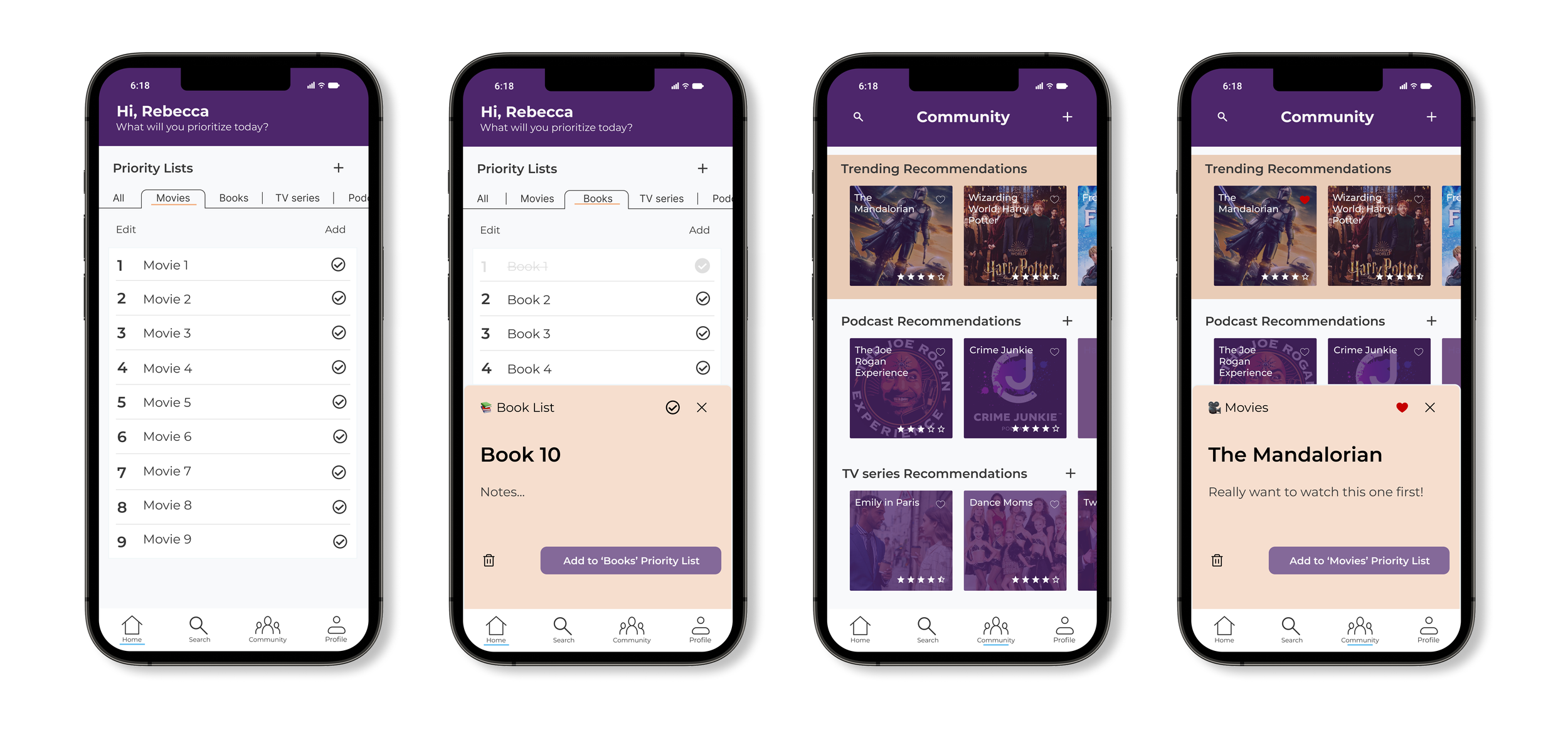
The UI components below would be utilized across multiple screens, notably the priority lists (unchecked and checked) as well as the slide up function with “Book 1” written on it that represents each individual item on a priority list.
My design was heavily inspired by one of my favorite apps that I use daily, Tweek. I wanted to utilize their drag-and-drop feature in order to organize each of the priority lists.

High-Fidelity Wireframes

When initially looking at color options for this “Sign In/Create Account” design, I thought I wanted the primary color to be a peachy orange, as shown in my color palette above. However, I found that purple exuded more of what I wanted- fun, creativity, togetherness. So, I changed my color palette:

The most important screens for this product are the priority lists, as noted by my desire for them to be the minimum viable product. With this design the user can add new priority lists; choose which list to view by swiping through the tabs; edit or add to each list; drag and drop items in their list to create priorities; view individual items on the list; write notes for each item; and even click a button to write recommendations for the item.

The community pages below were also important to Insight #5 of my research: Sharing recommendations is integral to creating an entertainment community amongst friends, family, strangers. I wanted to create a space where users can share what they love and find new entertainment options to add to their own priority lists. Although this is not the most important feature on this app, it creates a sense of togetherness that I wanted to highlight through my brand values.


I liked the way my designs looked, but they had to successfully do the task that the app is meant to do. I needed to test their process.
Testing
Methodology
In order to test how accurately and intuitively my designs accomplished what I hoped them to, I asked potential users to complete two new tasks that came about after the creation of my high-fidelity frames. These two iterated tasks made more sense over the initial tasks I created in my task flows:
View Book Priority List, check off Book #1 from the list, and add Book #10 to the list.
View the Community Page, save ‘The Mandalorian’ to Movie List.
By looking at how users go about these tasks, I was able to measure qualitatively and quantitatively how well my designs work.
Test Results
Qualitative Feedback:
Users enjoyed the overall layout and commented that it was clean.
The colors worked well together.
People tried to check off things and drag and drop when the prototype did not allow them to.
Users did not understand how to add something to a list after writing it out.
The blue line under each page icon was useful.
Users did not realize that the heart meant to add a recommendation to their list.
Maybe there should be more play-around options on the interactive prototype.
Quantitative Results:
Only two out of four potential users successfully completed both tasks. They mostly got confused on Task #1 when it came to adding Book #10 onto the Book List.
All four potential users successfully completed Task #2.
Iterate
The biggest iteration that I focused on was trying to make it intuitive when one is adding a new item to one of their prioritization lists.
Because the same button, “Make a Recommendation,” was present both when merely looking at an item on the list AND when creating a new item for the list, users did not realize that leaving the tab meant the task was added to the list.
My solution: There needed to be a button that explicitly noted that the new item was being added to the list. The before and after can be seen in the images to the right.

Old Design
New Design

Prototype
Final Thoughts
The final product showcases a simple way to organize entertainment recommendations one may receive, with the ability drag and drop options at ease; create categorized lists for different entertainment options; check off items already entertained; write a recommendation for others on the app; and find recommendations on the community page. This centralized view offers a method for having all recommendations in one place and an easy way to find what one may want to entertain in their downtime.
From this project I learned the importance of solidly defining what the problem is in a design. After conducting interviews, I felt that I needed to redefine the scope, really leaning into the problem and what exactly it was that I wanted to design. Utilizing tools like divergent thinking as well as including both user flows and task flows helped me hone in on the designs I would need in order to solve the problem at hand.