
SchoolsFirst Federal Credit Union
Adding a Feature to Ease the Account Switching Process

Project Scope: Imagine a project in which you add a feature onto an existing website/app within 80 hours to help improve a business. The final deliverable will be a high-fidelity prototype to hand off to the business.
My role: Sole Product Designer- User Research, UI, Testing
Overview
Background: SchoolsFirst Federal Credit Union is the largest Federal Credit Union in California and the largest credit union in the nation serving the educational community- including teachers, other education workers and their families. Their values are grounded in “ "here to serve and not to judge" and "people helping people." The credit union has low minimum balances and most accounts come without a fee. It is a great option for teachers and their families to manage their finances. SchoolsFirst Federal Credit Union has a responsive website and an app in which you can make digital transactions and manage your accounts within a certain login.
The Problem: There is no option on the website to add multiple SchoolsFirst logins. People hoping to rely on a good credit union and manage multiple bank accounts on the site or the app at once are met with a design issue in that there is no option to switch between accounts with ease. You would have to log out and log in to the other accounts to access the finances in each of them.
Who experiences this problem: Members of SchoolsFirst, or clients who are individuals with a background in education, who utilize and manage multiple accounts and need to see all of the information for each of them.
In order to dive deeper into the problem and what potential solutions could be, I needed to conduct user research.
Empathize
Research Goal
What challenges are associated with the inability to switch between accounts at ease. What pressure or extra time does this put on the user?
Research Objectives
Determine what constitutes a bank’s professionalism.
Determine what efficiency the customer wants to see from the business when going in between accounts.
Determine how customers would want to know that they are on a different account.
Understand frustrations people have faced in the past when trying to move between accounts.
Determine what features would incentivize one to choose one bank over another.
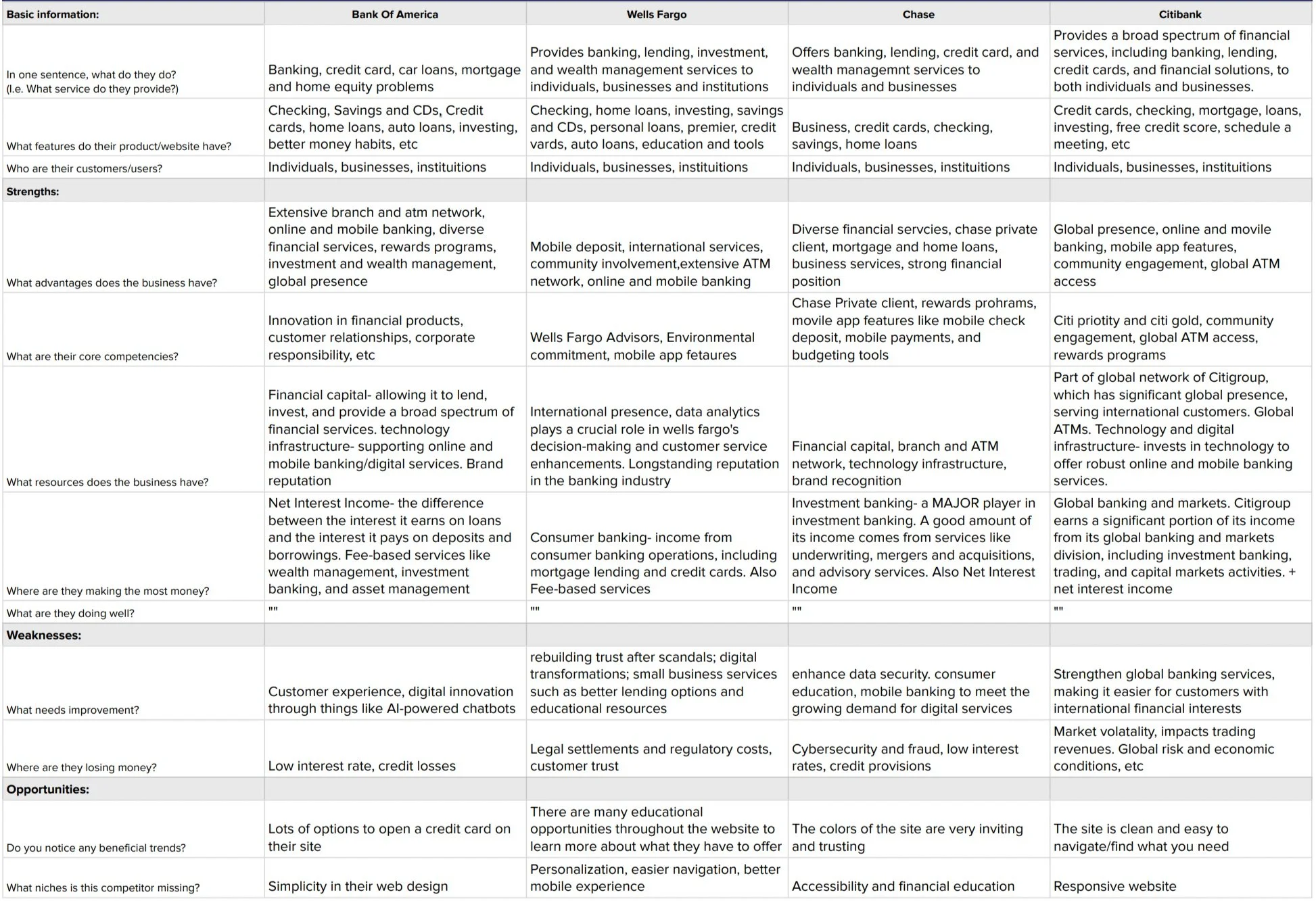
Competitive Analysis
In order to familiarize myself with this process, I took a look at the successes and drawbacks of the goals, trends and design processes of other banks.
User Interviews
After looking at competitors and how they go about their user goals and business goals, I interviewed five potential users over video chat who all utilized bank accounts and who would potentially have to manage a second account, either through their job or through their family needs.
Specific questions asked:
What is the current bank you use? How did you decide to use this bank?
What is it that you like about the current bank you use?
What do you not like about the current bank you use?
Have you utilized your bank’s online presence? What was your experience? Was it intuitive, hard to follow, etc?
How much does your experience with a business’s website matter to you, notably a bank? How do you judge the bank based off how good or bad their website is?
Tell me about any frustrations you’ve experienced with mobile or online banking
Have you had to monitor multiple bank accounts at the same time? How was that experience for you?
What would you expect from a bank’s website if you were to have to switch between two different accounts?
What is the best feature you have seen used by a bank? If not a bank, then just any business in general?
Affinity Map
With the information I received from each of my interviewees, I created an affinity map to sort all of the data and identify the insights I received by conducting the user interviews.
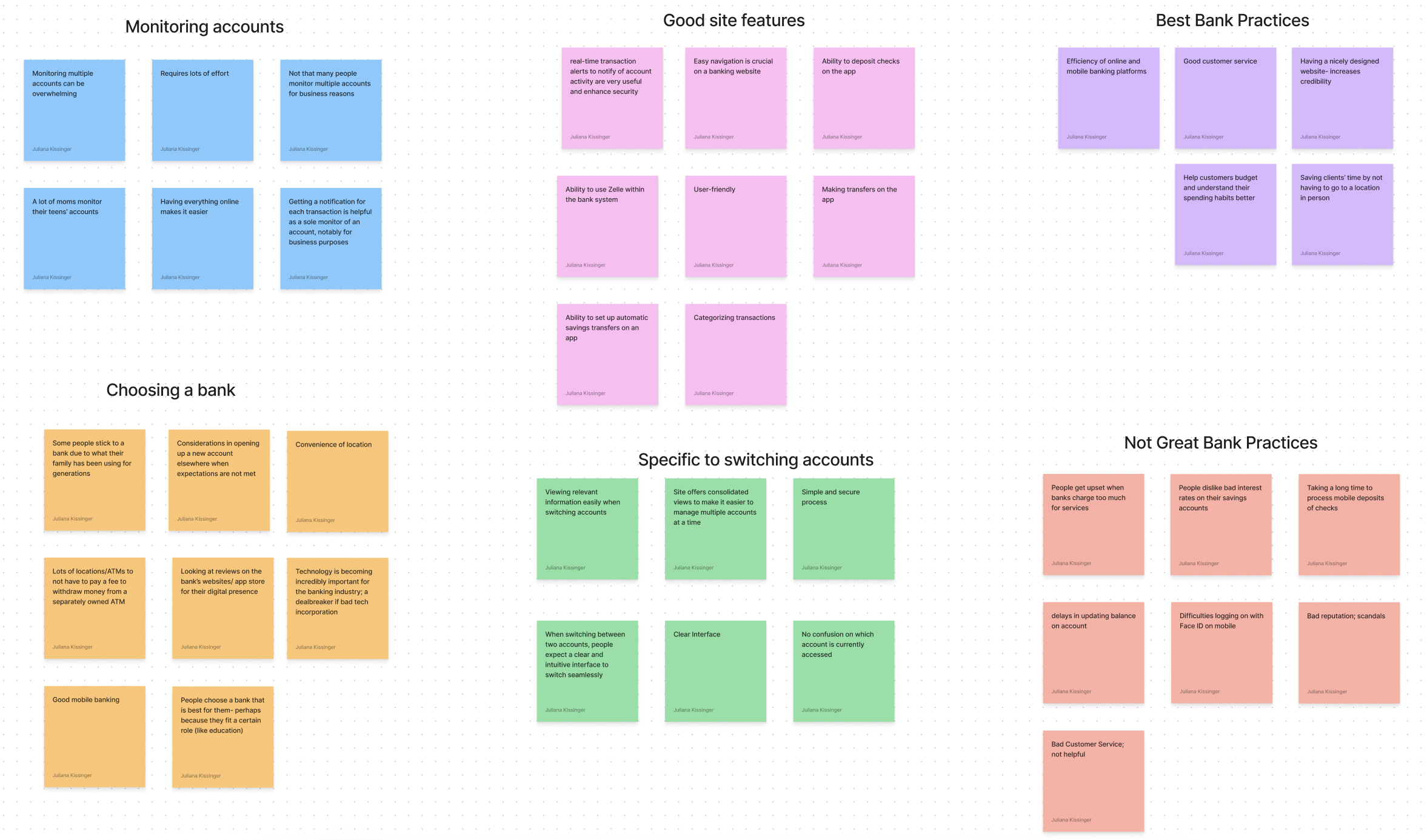
The accumulation of all of my research regarding how bank customers may switch between accounts helped me identify five conclusions that were applicable in the design thinking process before developing my frames:
Research Insights
Insight #1: Monitoring multiple accounts is overwhelming and requires lots of effort.
Insight #2: It would be easier for users who manage multiple accounts to see all of their data in one place.
Insight #3: Users depend on the efficiency of online and mobile banking platforms.
Insight #4: There should be no confusion about which account is being accessed.
Insight #5: Going between accounts should be seamless and easy.
Define
POVs and HMWs
POVs- What is the right problem to solve?
I’d like to explore ways to get more people to enjoy the Schoolsfirst website.
I’d like to explore ways to create a more intuitive and flexible experience for those monitoring two accounts on the Schoolsfirst website.
I’d like to explore ways to increase security amongst people who have to monitor multiple accounts.
I’d like to explore ways to ensure that clients are getting all the information needed when monitoring two accounts in a single bank.
HMWs
How might we create an interface that allows you to see both (or more) accounts’ statistics at once?
How might we make it easy, yet secure, to switch between accounts?
How might we ensure that the person monitoring accounts is getting all the information needed in order to do so?
How might we make the interface visually appealing?
Final POV and HMW:
I’d like to explore ways to create a more intuitive and flexible experience for those monitoring two accounts on the Schoolsfirst website.
How might we create an interface that allows you to see both (or more) accounts’ statistics at once? How might we ensure that the person monitoring accounts is getting all the information needed in order to do so?
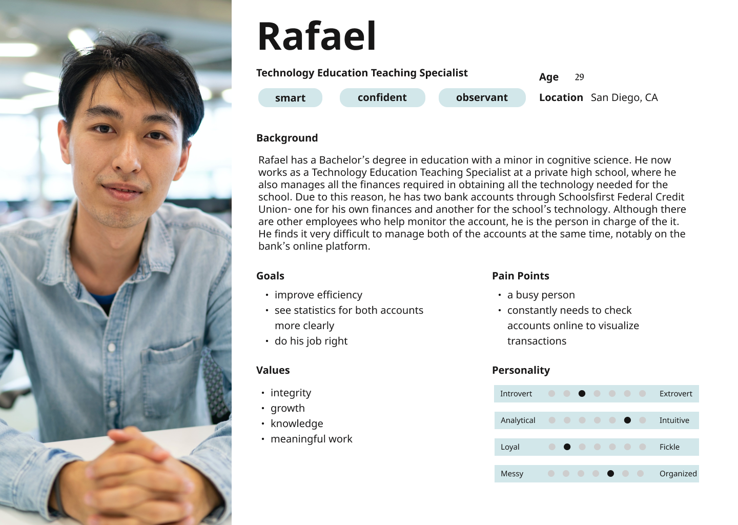
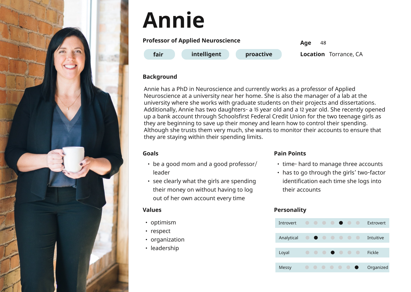
User Personas
Through my insights from secondary research and figuring out the right problem to solve, I put together two user personas who would benefit from the added feature to the SchoolsFirst design.
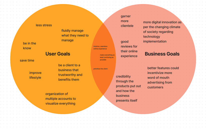
Project Goals
In order to make the best decisions, I strove to get a clear overview of the business goals and the user goals from my user research and analysis. I used a Venn diagram to outline the business goals, user goals, and common goals, shown below.
Ideate
Exploring Design Patterns.
Exploring Design Patterns.
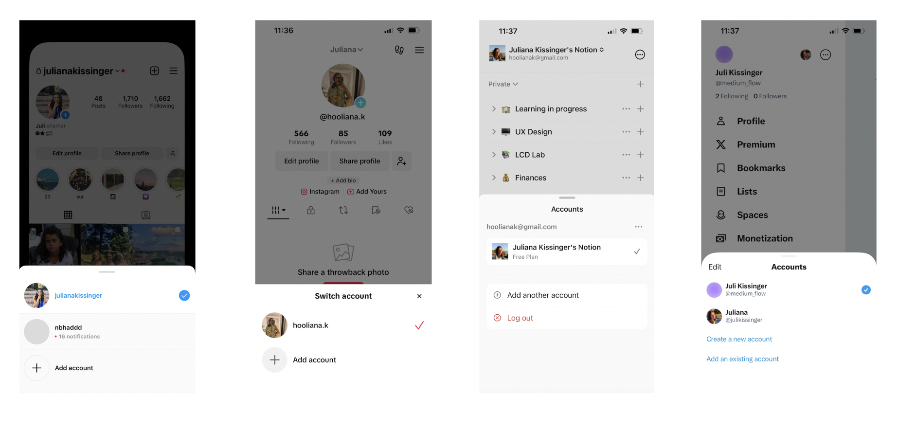
Before diving into the actual design, I wanted to see how other apps are currently implementing the “switch account” feature. After some searching on Instagram, TikTok, Notion, and X (formerly, Twitter), I found that the methodology they all used is quite similar: a tab that swipes up where one can easily view which account they are using and which one they can choose from next. Additionally, there is usually an “add account” button in this tab that helps the user organize the tab with ease.
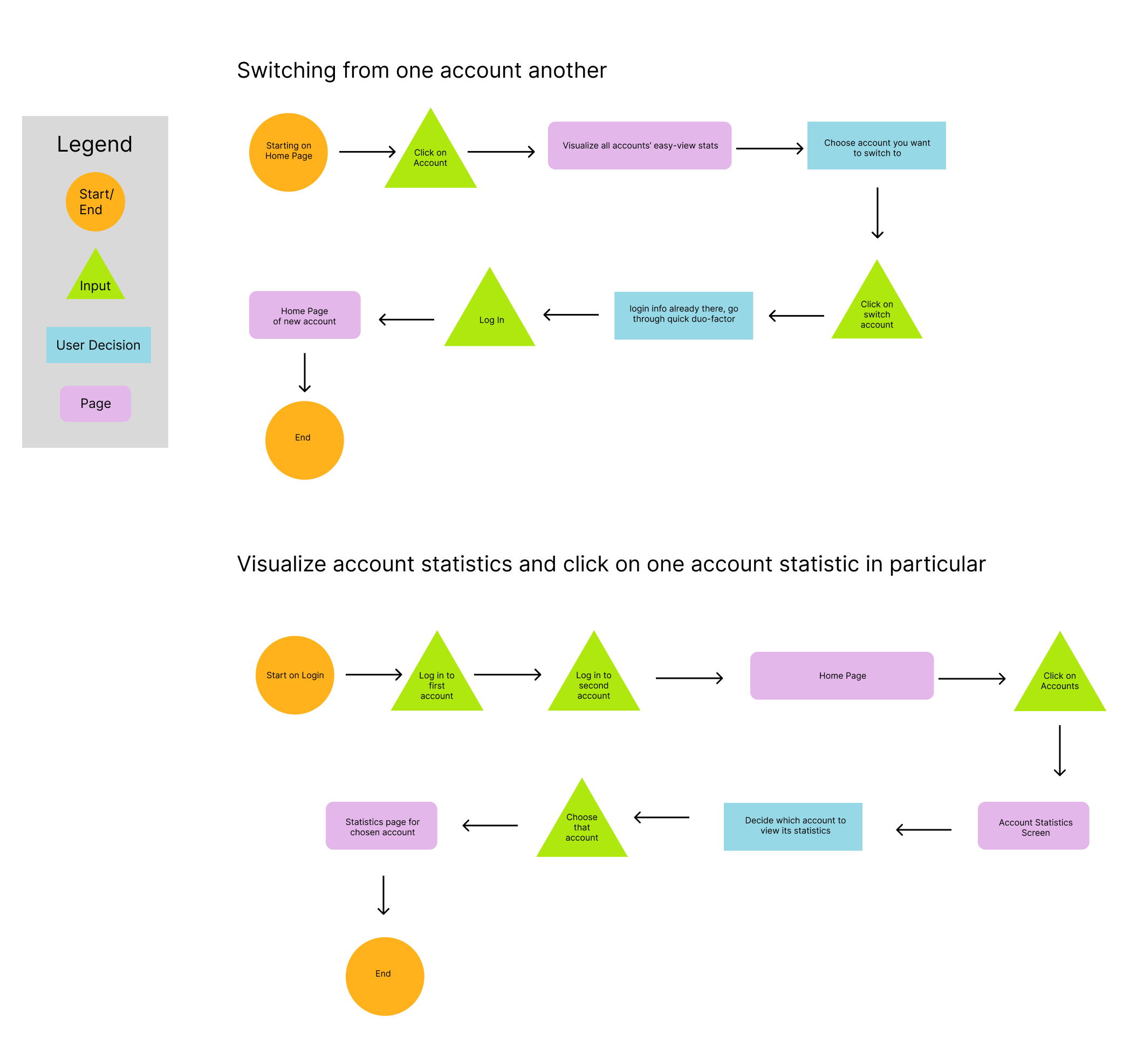
Task Flow
With other designs that work well in mind, I put together a task flow to make the wireframe process easier on me later in the project. I chose two tasks to focus on:
Task 1: Switching from one account to another.
Task 2: Visualizing account statistics and clicking on one account statistic in particular.
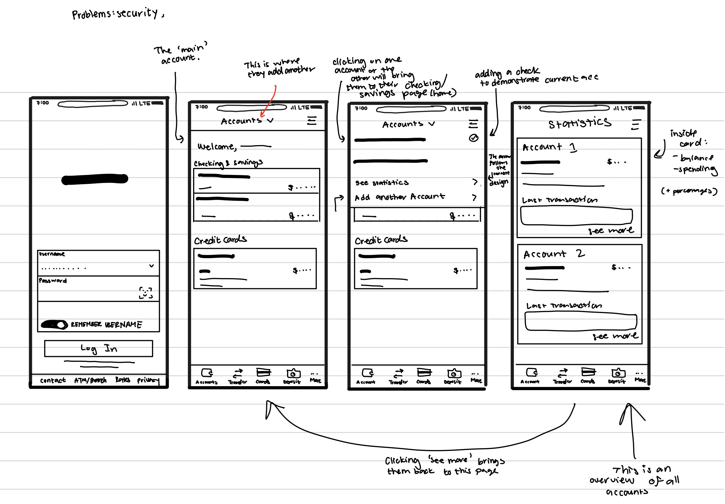
Low-fidelity wireframes
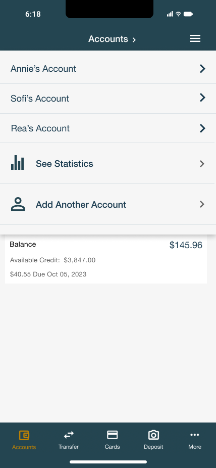
Through the culmination of everything I had found, I created my first wireframes. In order to put my own touch on the “Accounts” tab, like I had seen in other apps, I did a drop-down from the top rather than from the bottom.
Brand Systems
Although the brand for SchoolsFirst is already established, I thought it important to include the brand and its identity in this case study, as it pertinent to seamlessly adding a new feature into the existing design.
Below I put together the logo, the site colors, and the fonts necessary in order to accomplish such a task.
Logo:
Colors:
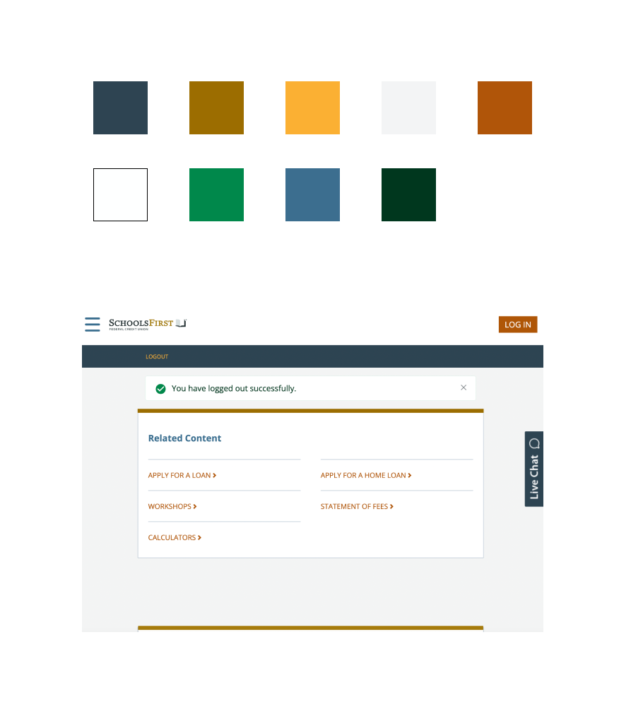
Fonts:

Mood Board
Despite already having the brand systems in place, having a mood board before creating the high-fidelity wireframes was useful to my process as it gave me an insight into how other banks’ designs work. Much like looking at existing design patterns, I wanted to find a certain energy to my design that exuded professionalism but also ease of use and practicality.

UI Components
High-Fidelity Wireframes
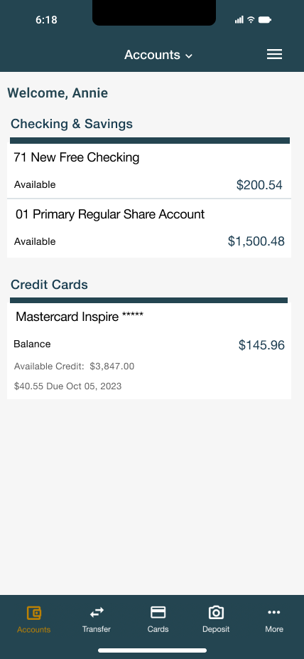
Login Screen

Home Screen
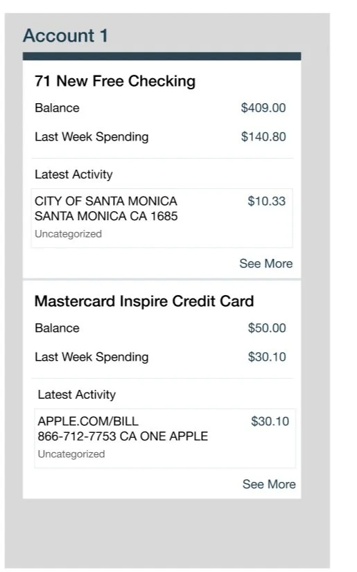
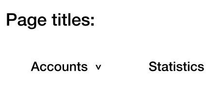
Accounts Screen
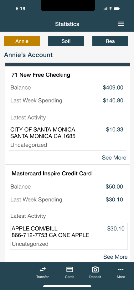
Statistics Screen
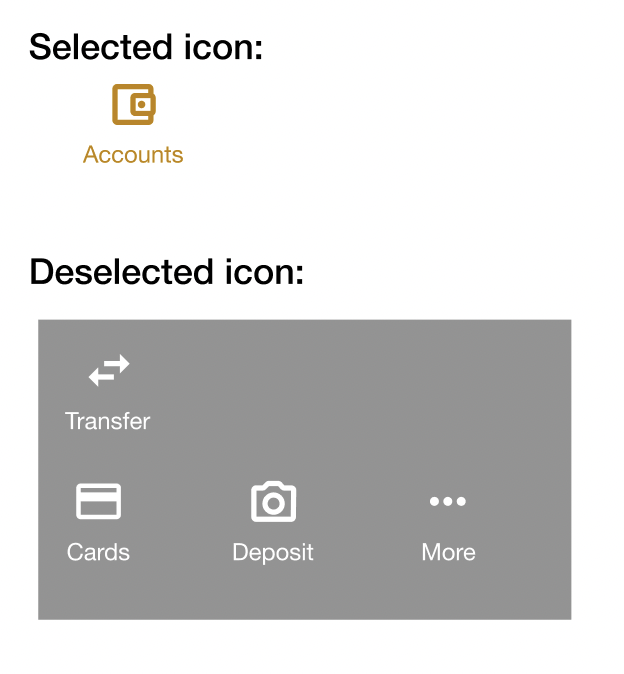
Icons utilized in the new tab added to the existing design of the app.
Comparisons
Vs.
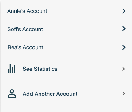
The drop down tab shown is one of the most important aspects to the new design. It demonstrates the ease of switching between bank accounts as well as the ability to see all statistics and add another account to the user’s lineup.
Additionally, it utilizes the same style of icons, font, and color that is already present throughout the rest of the app design.
Icons utilized in the original design of the app.
Testing
In order to establish credibility and ensure that my design for the SchoolsFirst app did what I intended it to do, I asked three different clients of SchoolsFirst, who are familiar with the app, to go through the following task flows:
Task 1: Switch from one account to another
Task 2: Visualize account statistics and find Sofi’s account statistics.
As users went through the prototype I constructed with the intention of completing the two tasks above, I measured how effective the design I created is at seamlessly switching between accounts and visualize the statistics of all accounts one has logged in on their app.
Test results
All three participants were able to successfully complete both tasks. The rate at which they did so was relatively equal and quick. However, there was slight pause for some with “See Statistics.” One user later expressed that he was initially confused by what “See Statistics” meant if he could just click on an individual account to look at spending details.
Two of the three users noted that the new design went along nicely with the rest of the app and it seemed as if the feature had already been there.
One user expressed their affinity to the carrot icon utilized to signify when the drop down menu on the Accounts Page is opened.
How might we come up to a solution for the confusion from the first result?
Rather than use the phrase “See Statistics,” which enabled confusion as to what statistics are being visualized, I looked at changing the phrase to something more straightforward. Looking at designs that have worked in the past, many use phrases like “Usage Statistics,” “Account Statistics,” or “Overview of Statistics.” In a sort of combination of some of the ideas, I decided to change the phrase in my design to “All Account Statistics.” This way, the user knows exactly what sorts of statistics they want will visualize upon pressing that button.
Along with the ability to monitor multiple accounts and their statistics at once, with this design the user is able to switch between accounts easily and can clearly see which account it is they are looking at. The user experience is improved as there is less frustration with having to log in and out multiple times to visualize multiple accounts that one may be in charge of.
Prototype
Final Thoughts
How is my design work successful?
The final product solved the challenge of switching between accounts with ease by providing a tab with all accounts that are already logged in. The user can add another account to their roster in order to organize those that are available to them. Additionally, the user can view recent transactions in all logged-in accounts through the “All Account Statistics” button on the tab.
This project was challenging to me as I had to stay within the parameters of the design that was already present throughout the SchoolsFirst app. However through this obstacle I learned that there is immeasurable impact of a design on a company and how its users interact with that company. This is notably true with the design’s goal to limit users’ frustrations as much as possible while simultaneously increasing revenue and overall successes of the business. I learned through the research and development of this feature on the SchoolsFirst app that there is a balance between user needs and business needs where design plays a large role.